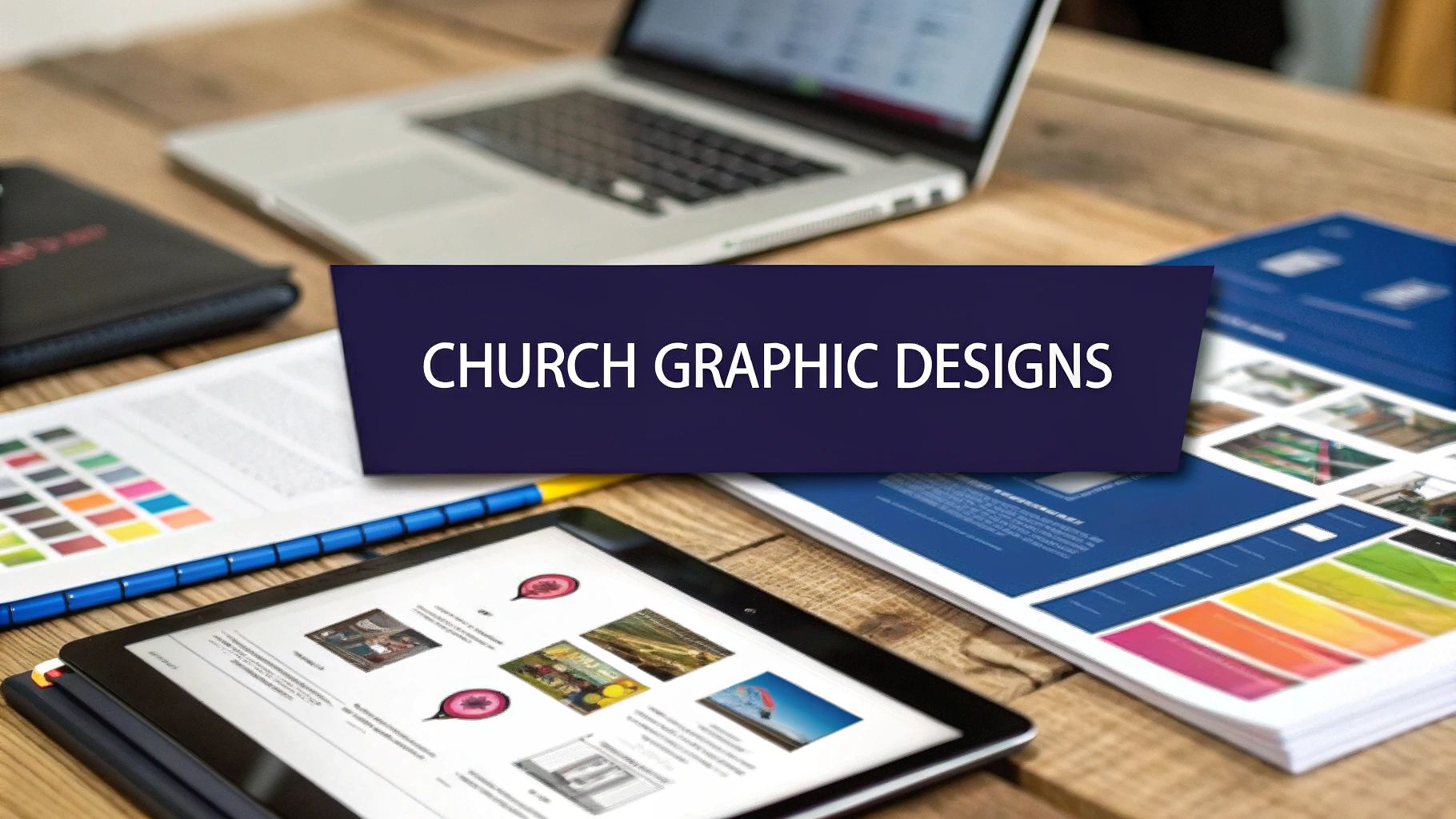
In a scroll-driven culture, your church’s message has only seconds to capture attention before it’s lost in the digital noise. Strong, intentional church graphic designs are no longer a luxury for large ministries; they are an essential tool for effective communication and outreach for every congregation. A compelling graphic can stop a hurried thumb, clearly convey an event detail, and powerfully reflect the heart of a sermon, making your ministry’s digital presence feel both relevant and welcoming.
This article moves beyond generic advice to provide a strategic breakdown of standout church graphic design examples. We will analyze seven distinct styles, from modern typography to minimalist geometrics, exploring the specific elements that make them work. For each example, you’ll find a deep dive into the design strategy, specific tactical insights, and actionable takeaways you can apply to your own projects.
Our goal is to equip you with replicable methods to elevate your visual communications. You'll learn not just what looks good, but why it connects and how to implement these ideas effectively. Whether you're designing for a sermon series, a community event, or a simple Sunday reminder, these principles will help you create graphics that resonate. And for churches looking to streamline this entire process, tools like ChurchSocial.ai offer graphic templates, AI-powered content creation from sermons, and an integrated social media calendar to manage it all effortlessly. Let's explore the designs that are making an impact.
1. Modern Typography-Based Church Branding
Modern typography-based branding is a powerful approach in the world of church graphic designs. It shifts the focus from traditional imagery to the power of words, using clean, contemporary fonts as the primary design element. This method relies on strong typographic hierarchy, thoughtful font pairings, and strategic use of negative space to create a visually appealing and emotionally resonant brand identity. Churches like Hillsong and Elevation have successfully used this style to build a modern, accessible, and culturally relevant presence that appeals to a younger, design-conscious demographic.
Why It Works
This design philosophy excels because it communicates clarity and confidence. By stripping away complex visual metaphors, the message itself becomes the focal point. A well-chosen typeface can convey a specific mood, whether it's the stability of a bold sans-serif or the elegance of a classic serif. This directness helps build trust and makes all communications, from sermon series graphics to social media announcements, feel cohesive and intentional. It’s an effective strategy for churches aiming to project a fresh, uncluttered, and forward-thinking image.
For a quick overview, this summary box highlights the key features, advantages, and potential drawbacks of adopting a typography-based branding strategy.
As the infographic shows, while this approach offers significant advantages in clarity and modernity, its success depends heavily on skilled design execution to avoid appearing overly simplistic.
How to Implement This Style
Implementing this style requires a clear brand strategy. Start by selecting two to three primary fonts that reflect your church's personality. Use a clear hierarchy to guide the viewer’s attention: a bold, impactful font for headlines, a readable one for body text, and an accent font for special callouts. Consistency is crucial; apply these typographic rules across all platforms, from your website to your print materials.
To streamline this process, ChurchSocial.ai offers a wealth of templates that make implementing sophisticated church graphic designs simple. You can easily create and post professional, typography-focused graphics with our editor and schedule them using our drag-and-drop calendar, ensuring your brand remains consistent and compelling online.
2. Hand-Drawn Illustration Style
The hand-drawn illustration style offers a warm and deeply personal approach to church graphic designs. This aesthetic moves away from polished, corporate visuals in favor of artistic sketches, custom lettering, and unique illustrations. It creates an approachable, community-focused feel that is authentic and human-centered, bridging the gap between digital design and traditional art. Churches like The Village Church often use this style for sermon series graphics to convey a sense of craftsmanship and thoughtful reflection.
Why It Works
This design philosophy thrives on its ability to communicate authenticity and warmth. In a digital world saturated with slick, impersonal graphics, hand-drawn elements feel genuine and relatable. They suggest that a real person, not just a program, is behind the message, fostering a stronger sense of community and connection. This style can make complex theological concepts feel more accessible and event promotions seem more like personal invitations. It’s an ideal strategy for churches wanting to project a creative, organic, and welcoming personality.
For a quick overview, this summary box highlights the key features, advantages, and potential drawbacks of adopting a hand-drawn illustration style.
As the infographic illustrates, the personal touch of this style is a major advantage, but maintaining visual consistency requires a clear artistic direction to avoid a fragmented look.
How to Implement This Style
Successfully implementing a hand-drawn style begins with establishing a consistent artistic direction. Define a core illustration style, whether it’s simple line art, detailed sketches, or watercolor accents. Partner with artists within your congregation or use digital tools that simulate hand-drawn effects to create a cohesive set of visual assets. Apply these elements consistently across social media posts, bulletin covers, and event promotions to build a recognizable brand identity.
To bring this authentic feel to your online presence, ChurchSocial.ai provides graphic templates that beautifully incorporate hand-drawn elements. Our editor makes it easy to customize these church graphic designs with your specific event details or sermon titles. You can then schedule them directly to all your social platforms using our drag-and-drop calendar, ensuring your church’s warm and artistic voice is heard consistently online.
3. Photographic Storytelling Design
Photographic storytelling is a powerful visual approach that grounds your church’s communications in authenticity and human connection. This style leverages high-quality, genuine photography as the centerpiece of design, often featuring inspiring landscapes, symbolic objects, or moments of quiet reflection. Instead of relying on generic stock imagery, this method captures the true spirit of your church's message, using compelling visuals paired with minimal text overlays to tell a story. This approach creates an immediate sense of belonging and relatability without focusing on specific individuals.

Why It Works
This design philosophy thrives on authenticity, which builds trust faster than any other element. When people see images that evoke emotion and connection, it breaks down barriers and makes the church feel more accessible and real. This approach transforms abstract concepts like "community" and "worship" into tangible, visible experiences. For churches wanting to emphasize their genuine, people-focused culture, using impactful photography in their church graphic designs is an incredibly effective strategy to foster a deep, emotional connection with their audience. To effectively use visuals to convey your ministry's message, consider exploring how to master visual storytelling techniques.
How to Implement This Style
Implementing this style begins with a commitment to capturing authentic moments and scenes. Invest in quality photography, whether by hiring a professional or empowering a skilled volunteer with the right equipment. Create a photo style guide to ensure consistency in lighting, composition, and mood across all images. Building a dedicated photo library categorized by seasons, events, and themes will provide a steady stream of content for sermon series, social media, and event promotions. To see more examples of how churches are using visual media, you can explore our detailed guide on effective church visual media.
With ChurchSocial.ai, you can easily integrate your authentic photography into professional templates. Our editor allows you to upload your images and create stunning graphics for any platform. You can then schedule and manage all your posts with our simple drag-and-drop calendar, ensuring your visual storytelling remains consistent and impactful across all your social media channels.
4. Vintage/Retro Church Aesthetics
Vintage and retro aesthetics offer a nostalgic and warm approach to church graphic designs. This style draws inspiration from mid-century design, classic Americana, and the visual language of the 1950s to 1970s. It often features distressed textures, muted or retro color palettes, and script or serif fonts that evoke a sense of history and timelessness. Churches use this aesthetic to create a feeling of authenticity, tradition, and comfort, connecting modern messages with a familiar, time-honored feel.
Why It Works
This design style excels because it taps into a collective sense of nostalgia and reliability. Retro visuals can make a church feel established and grounded, even if it's a new plant. The aesthetic suggests that the church's values are enduring and its message is rooted in something deeper than current trends. This approach is particularly effective for sermon series on foundational topics or for creating an inviting, community-focused brand identity that feels both unique and deeply familiar. It communicates warmth, character, and a commitment to lasting truths.
This style provides a distinct visual identity that stands out from the more common modern minimalist designs. While it offers a unique charm, it requires a careful balance to avoid feeling outdated or gimmicky.
How to Implement This Style
Successfully implementing a vintage look requires authenticity. Start by researching design elements from a specific era that aligns with your church’s personality. Focus on incorporating key elements sparingly, such as a retro font for a headline or a distressed texture as a background layer, to avoid overwhelming the design. It's crucial that readability is never sacrificed for style; ensure your body text remains clear and legible. Balance vintage charm with modern usability, especially for digital platforms like websites and social media.
Creating these distinct church graphic designs is straightforward with ChurchSocial.ai. Our platform provides a library of templates with vintage and retro themes that you can customize in our user-friendly editor. You can craft beautiful, nostalgic graphics for your sermon series or events and schedule them directly to all your platforms using our drag-and-drop calendar, ensuring a consistent and engaging presence.
5. Minimalist Geometric Design
Minimalist geometric design offers a sophisticated and structured approach to church communications. This style uses clean geometric shapes, strategic negative space, and a limited color palette to create graphics that are both modern and meaningful. It relies on the mathematical precision of shapes like circles, squares, and triangles to convey stability, order, and intentionality. Churches like C3 and many contemporary Presbyterian and Lutheran congregations have adopted this style to create a clean, organized, and intellectually engaging brand identity.
Why It Works
This design philosophy is powerful because it communicates complex ideas with elegant simplicity. Geometric forms are universal symbols that can represent concepts like unity (circles), stability (squares), and direction (triangles). By stripping away unnecessary ornamentation, the core message is amplified, creating a sense of clarity and purpose. The structured, grid-based layouts inherent in this style make all communications feel cohesive and well-planned, from sermon series art to event flyers. It’s an ideal choice for churches that want to project a thoughtful, modern, and intellectually grounded image.
For a deeper dive into creating this clean look, you can find a wealth of resources and inspiration. You can learn more about how to apply these principles with free church graphics templates that provide a solid foundation for your designs.
How to Implement This Style
Successfully implementing a minimalist geometric style requires discipline and a clear plan. Start by establishing a strong grid system that will govern all your layouts, ensuring consistency. Limit your color palette to two or three complementary colors to maintain a clean, uncluttered feel. Use geometric shapes not just for decoration but as functional elements that guide the eye or frame important information. The key is to ensure every element serves a distinct purpose, reinforcing the overall message with precision and clarity.
ChurchSocial.ai simplifies the creation of these sophisticated church graphic designs. Our platform offers a library of professionally designed templates that you can easily customize with our editor. You can create stunning, on-brand geometric graphics and use our drag-and-drop calendar to schedule them across all your social media platforms, maintaining a polished and consistent online presence effortlessly.
6. Nature and Creation-Themed Graphics
Nature and creation-themed graphics offer an organic design approach that grounds a church's visual identity in the beauty of the natural world. This style incorporates elements like majestic mountains, serene forests, flowing water, and expansive landscapes to symbolize growth, peace, and God's handiwork. By utilizing earthy color palettes, organic textures, and high-quality nature photography, these designs create a calming and awe-inspiring atmosphere that resonates with themes of renewal, stewardship, and divine wonder. It's a style often seen in the branding for outdoor ministries, rural churches, and congregations that emphasize creation care.

Why It Works
This design philosophy is effective because it taps into a universal appreciation for nature, creating an immediate sense of connection and tranquility. Images of creation can powerfully illustrate spiritual concepts like growth, seasons of life, and the vastness of God, making abstract ideas feel tangible and relatable. This approach is especially powerful for seasonal events like Easter (symbolizing rebirth) or fall festivals, as it aligns the church calendar with the natural rhythm of the year. It provides a visual language that feels both timeless and deeply personal, fostering a welcoming environment.
How to Implement This Style
To effectively implement this style, begin with a library of high-resolution, professional nature photography. Prioritize images that reflect your local geography to create a stronger connection with your community; a church in Colorado might use mountains, while one in Florida might use coastal scenes. Ensure your typography is clean and highly legible, standing in clear contrast to the often detailed background images. Using a semi-transparent color overlay can help text pop without obscuring the beautiful scenery behind it.
Creating these compelling church graphic designs is straightforward with ChurchSocial.ai. Our platform provides a vast collection of templates featuring stunning nature imagery, which you can easily customize in our editor. You can then schedule these posts directly to your social media platforms using our simple drag-and-drop calendar, ensuring your message of growth and renewal is shared consistently and beautifully.
7. Bold Color Block Design
Bold color block design is an energetic and visually assertive approach to church graphic designs. This style utilizes large, solid blocks of saturated color as the foundational element, often paired with high-contrast typography and minimal imagery. It’s designed to grab attention immediately, making it perfect for crowded social media feeds and event promotions. Churches like Transformation Church have mastered this style, using vibrant color palettes to create a brand that feels dynamic, passionate, and culturally current.
Why It Works
This design philosophy succeeds because it communicates energy and excitement with unapologetic confidence. The use of bold, flat colors creates a clean, modern aesthetic that feels both organized and full of life. It’s an excellent way to differentiate your church's communications and appeal to younger audiences who are accustomed to bold visuals in digital media. This style is particularly effective for sermon series, youth events, and conferences where the goal is to generate hype and convey a sense of movement and passion.
The high contrast between color blocks and text also ensures excellent readability, making your message clear and impactful. This directness helps your graphics stand out and effectively communicate key information at a glance, whether on a screen or in print.
How to Implement This Style
To implement this style, start by defining a vibrant yet harmonious color palette that aligns with your church’s brand identity. Use tools based on color theory to find complementary or contrasting colors that work well together. Assign specific colors to different types of content to build visual consistency. For instance, you could use one primary color for Sunday service announcements and another for a specific ministry's events.
Combine these color blocks with strong, legible typography. A bold, sans-serif font often works best to maintain a modern feel. Ensure there is enough contrast between your text and the background color to keep everything readable. Consistency is key, so apply these color and font rules across all your materials to build a recognizable and energetic brand presence.
You can effortlessly create striking color block graphics using ChurchSocial.ai. Our template library and intuitive editor make it simple to design professional visuals that capture this dynamic style. Once created, you can schedule all your posts to go out automatically with our drag-and-drop calendar, ensuring your church's social media is consistently vibrant and engaging.
7-Style Church Graphic Design Comparison
From Inspiration to Implementation: Your Next Step in Church Social Media
We've journeyed through a vibrant landscape of modern church graphic designs, from the clean authority of minimalist typography to the authentic touch of hand-drawn illustrations and the evocative power of photographic storytelling. Each example, whether rooted in retro aesthetics or bold color blocking, carries a core strategic lesson: effective design is not just about looking good; it's about communicating a clear message that resonates with your community and invites newcomers into the fold.
The ultimate goal of strong church graphic designs is to build bridges. It's about translating the timeless message of the Gospel into a visual language that today's culture can instantly understand and connect with. Your graphics are often the very first "handshake" your church offers to someone scrolling through their social media feed. They are digital missionaries, working 24/7 to convey your church's heart, vision, and warmth.
Key Strategic Takeaways
As you move from inspiration to your own design work, keep these foundational principles at the forefront:
- Clarity Over Clutter: The most powerful designs often say the most with the least. Prioritize a single, clear message for each graphic to avoid overwhelming your audience.
- Consistency Builds Trust: Whether you adopt a nature-themed palette or a geometric pattern, consistency across your platforms creates a recognizable and reliable brand identity. This visual cohesion tells people you are intentional and organized.
- Authenticity Attracts: Your designs should reflect the genuine personality of your congregation. If you're a warm, rustic community, a sleek, corporate design might feel disconnected. Align your visuals with your true identity.
Your Actionable Next Steps
Feeling inspired is wonderful, but turning that inspiration into high-quality, consistent content is the real challenge, especially for busy church staff and volunteers. The key is to build a sustainable workflow that doesn’t lead to burnout. This is where a dedicated platform like ChurchSocial.ai becomes a game-changer for your ministry.
With ChurchSocial.ai, you can transform your sermons into engaging social media content. Our AI can generate reels, social posts, and even blog articles directly from your sermon transcripts. You can use our extensive library of graphic templates and a powerful editor to create stunning photos and carousels. Our simple drag-and-drop calendar lets you easily manage and update all of your social media accounts in one place. Plus, we integrate with Planning Center and other church calendars to automatically create content for your upcoming events.
A crucial technical detail in this process is ensuring your designs are perfectly formatted for each platform. To prevent awkward cropping or low-resolution images, mastering the correct social media post dimensions is essential to ensure your visuals always look their best. By starting with the right canvas size, you guarantee your hard work is presented professionally every time. Ultimately, a strategic approach transforms your church graphic designs from a weekend task into a powerful ministry tool, amplifying your reach and deepening your impact.
Ready to streamline your entire social media process? ChurchSocial.ai is an all-in-one platform built specifically for churches, allowing you to generate sermon clips, create stunning graphics from templates, and schedule all your content from a simple drag-and-drop calendar. Stop struggling with multiple tools and start creating impactful content with ease at ChurchSocial.ai.