Choosing the right colors for your church goes far beyond simple aesthetics; it's about creating an atmosphere that welcomes, inspires, and communicates your unique identity. The colors on your walls, in your branding, and across your social media shape the first impression for visitors and deepen the connection for members. A well-chosen palette can evoke reverence, warmth, joy, or peaceful contemplation, setting the stage for worship and community long before a service begins.
To make informed decisions about your church's aesthetic, it is beneficial to understand the principles of color psychology in branding and how different hues impact emotion. However, translating this vision into a cohesive brand identity can be challenging. Juggling sermon prep, event planning, and community outreach leaves little time for graphic design and social media management. This is where a unified visual strategy becomes crucial.
In this guide, we'll explore 8 distinct church color palettes, providing the inspiration you need. We'll also show you how to effortlessly apply these palettes to your digital outreach. With ChurchSocial.ai, you can transform your sermon transcript into AI-generated reels and social posts, use professional graphic templates, and manage your entire social media strategy with a simple drag-and-drop calendar, creating a consistent and beautiful online presence that reflects your ministry's heart.
1. Traditional Gothic Cathedral Palette
The Traditional Gothic Cathedral Palette channels the awe and reverence of historic sacred spaces. This color scheme is defined by deep, rich tones like burgundy red, midnight blue, and regal purple, often accented with the gleam of metallic gold. Inspired by the stained glass and stone interiors of cathedrals like Notre-Dame and Westminster Abbey, this palette creates an atmosphere of solemnity, spiritual depth, and enduring tradition. It's an excellent choice for denominations with a strong liturgical heritage or any church wanting to convey a sense of history and theological gravity.

This palette isn't just for sanctuary walls; it translates powerfully to digital media, creating visually striking, high-contrast graphics perfect for social media. When designing sermon announcements or scripture posts, these deep hues make white or gold text pop, immediately capturing attention and conveying a message of substance.
How to Implement This Palette
- For Worship Spaces: Use the deepest colors on accent walls, in textiles like banners or altar cloths, or in carpeting to ground the space. Balance the darkness with lighter neutrals like stone gray or warm cream on larger walls to prevent the room from feeling too heavy.
- For Digital Design: In your graphics, use a deep burgundy or blue as a background for key announcements. Employ a gold or bright cream for your primary text to ensure readability and add a touch of elegance. This creates a focal point that draws the eye.
Pro Tip: Liturgical colors are central to this palette. Use a content calendar to align your digital and physical color schemes with the seasons of the church year, such as purple for Advent and Lent or red for Pentecost.
Managing Your Content Calendar
Keeping your visual branding consistent, especially with a seasonally-influenced palette, requires careful planning. This is where ChurchSocial.ai becomes invaluable. Its simple drag-and-drop calendar allows you to schedule posts weeks or months in advance, ensuring your graphics match the current liturgical season. You can use its graphic templates and editor to create a set of designs for each seasonal color shift, making the transition seamless and professional across all your social media platforms.
2. Warm Earth Tones Palette
The Warm Earth Tones Palette fosters a welcoming, community-focused atmosphere, trading formal grandeur for intimate connection. This scheme is built on rich browns, soft golds, and warm creams, creating a sense of comfort, belonging, and spiritual warmth. Drawing inspiration from natural materials like wood, clay, and stone, this is one of the most inviting church color palettes. It's ideal for congregations that prioritize fellowship and accessibility, such as many contemporary Baptist, Methodist, or non-denominational churches.

This palette translates exceptionally well to social media, creating a feed that feels authentic and approachable. Graphics using these colors feel less like institutional announcements and more like a warm invitation. The gentle, low-contrast nature is easy on the eyes, encouraging followers to pause and engage with sermon clips, event details, or inspirational quotes.
How to Implement This Palette
- For Worship Spaces: Use varying shades of brown and tan to create visual depth on walls. Incorporate natural textures like wood beams, stone accents, or woven fabrics in seating. Enhance the organic feel with live plants and warm lighting to make the space feel alive and comforting.
- For Digital Design: Set your graphic backgrounds with a soft cream or light tan. Use a rich chocolate brown for primary text and a subtle gold as an accent color for headings or key words. This creates a clean, readable design that feels grounded and genuine.
Pro Tip: Texture is your best friend with this palette. In digital graphics, use subtle background textures like paper, wood grain, or linen to add depth and prevent the design from looking flat. This mimics the natural materials that inspire the palette.
Managing Your Content Calendar
Creating a consistent, warm, and inviting online presence requires steady content creation and scheduling. It's easy for posts to become sporadic when relying on volunteer time, which can disrupt the sense of community you're trying to build.
This is where ChurchSocial.ai can make a significant impact. You can generate AI-powered social posts, blogs, and even reels directly from your sermon transcript, ensuring your authentic message is always at the forefront. Use the platform's graphic templates and editor to design cohesive visuals with your earthy tones, then schedule everything on the simple drag-and-drop calendar to maintain a consistent, welcoming online presence.
3. Clean Contemporary Whites
The Clean Contemporary Whites palette offers a modern, minimalist approach that emphasizes simplicity, purity, and spiritual clarity. This scheme is built on various shades of optic white, warm cream, and light dove gray, creating a clean, uncluttered environment. Inspired by Scandinavian church design and modern worship spaces like those seen in Hillsong churches, this palette strips away visual distractions, allowing the focus to shift entirely to worship, community, and the message being shared. It's an ideal choice for non-denominational churches or any congregation aiming for a fresh, approachable, and bright atmosphere.
This minimalist aesthetic translates beautifully to social media, creating a clean and cohesive brand identity. The simplicity of the palette ensures that content is easy to read and visually calming amidst a busy social feed. For churches that value clear communication and a modern feel, this is one of the most effective church color palettes to adopt for both physical and digital spaces.
How to Implement This Palette
- For Worship Spaces: Layer different tones of white and light gray to add depth and prevent the space from feeling sterile. Introduce warmth and texture with natural wood accents, live plants, and soft textiles. Strategic lighting is key to creating ambiance and highlighting architectural features.
- For Digital Design: Use a clean white or light gray background for your graphics. Employ a single, bold accent color for calls to action or key information. The focus should be on strong typography and high-quality imagery. For more tips, you can explore our guide to church graphic designs.
Pro Tip: Texture is your best friend with a monochromatic palette. In your digital designs, consider using subtle paper textures or light gradients in your backgrounds to add visual interest without compromising the clean, minimalist feel.
Managing Your Content Calendar
A minimalist brand identity relies on strict consistency. Every post, from sermon clips to event announcements, must align with the clean aesthetic to maintain its impact. This requires careful planning to ensure every piece of content fits the visual standard.
ChurchSocial.ai makes this level of consistency achievable. You can create a library of branded graphic templates directly within the platform, ensuring every post uses the correct fonts and white-centric color scheme. The AI can take your sermon transcript and produce clean, on-brand social posts, blogs, and even AI-generated reels that match your contemporary aesthetic, all planned and scheduled on a simple drag-and-drop calendar.
4. Liturgical Seasonal Colors
The Liturgical Seasonal Colors palette is not a single scheme but a dynamic system that aligns your church's visual identity with the rhythms of the Christian calendar. This approach uses specific colors to signify different theological seasons: penitential purple for Advent and Lent, celebratory white or gold for Christmas and Easter, vibrant red for Pentecost, and verdant green for Ordinary Time. Embraced by Roman Catholic, Anglican, Lutheran, and Methodist traditions, this is one of the most historically rooted church color palettes, connecting a congregation's visual experience directly to the narrative of the gospel year.
This intentional use of color offers a powerful, non-verbal teaching tool, visually reinforcing the themes of worship each week. It creates a cohesive experience, where the colors seen on social media graphics for an Advent series perfectly match the paraments and banners within the sanctuary, deepening the congregation's engagement with the season.
How to Implement This Palette
- For Worship Spaces: Focus on changeable elements. Use colored paraments for the altar and pulpit, hang seasonal banners, and incorporate colored lighting to reflect the current season without needing to repaint walls.
- For Digital Design: Create a template for each liturgical color. A purple-themed graphic for Lenten sermon announcements can be easily swapped for a green-themed one when Ordinary Time begins, ensuring your online presence is always in sync with your in-person worship.
Pro Tip: Educate your congregation on the meaning behind the colors. A short segment in a sermon, a post on social media, or a note in the bulletin can turn a design choice into a moment of discipleship, explaining why the church is adorned in purple or green.
Managing Your Content Calendar
Coordinating a constantly changing color palette across multiple platforms and seasons is a significant logistical challenge. Planning your Lent graphics while you're still in the Christmas season requires foresight and organization to avoid last-minute stress and maintain a professional look.
This is where ChurchSocial.ai is essential. Its drag-and-drop calendar allows you to schedule your liturgical-themed posts months in advance. You can prepare all your Advent, Christmas, and Epiphany content at once, using dedicated graphic templates for each season and scheduling them to post automatically. The platform even integrates with Planning Center and other church calendars to help create content for events, ensuring your digital outreach seamlessly mirrors the sacred rhythm of your church year.
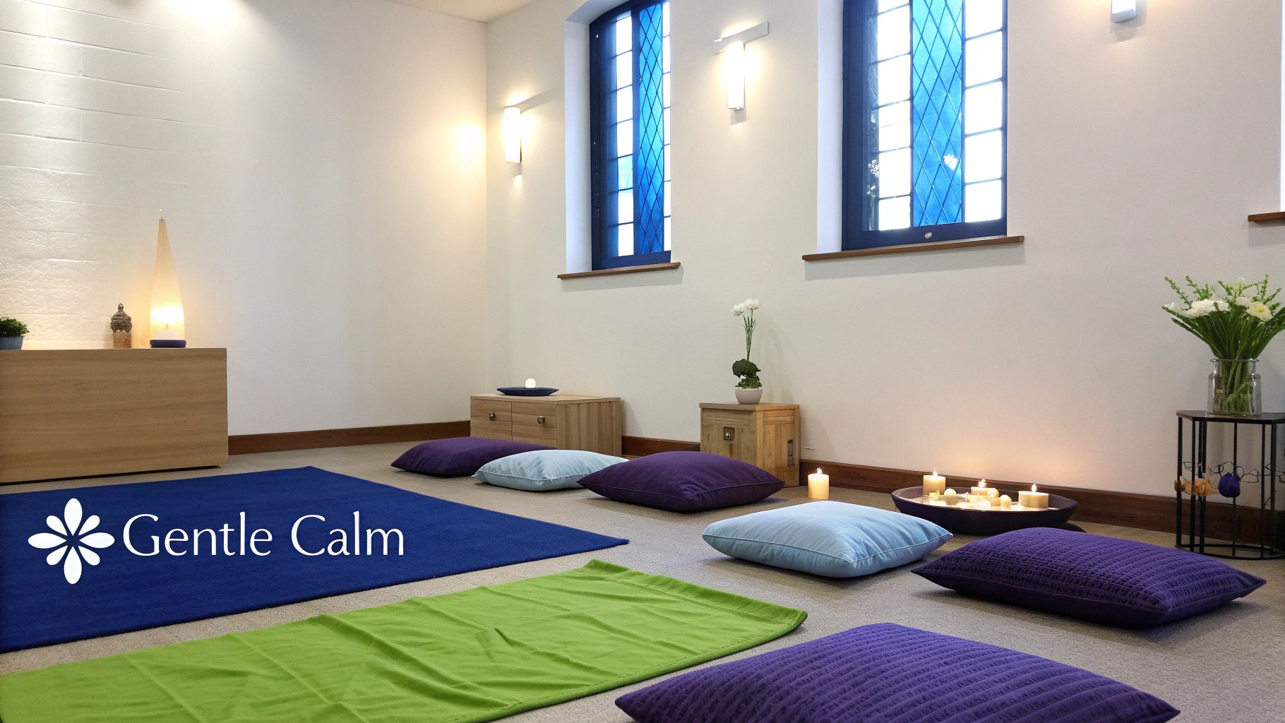
5. Soft Pastels and Light Blues
The Soft Pastels and Light Blues palette creates a serene, nurturing, and welcoming atmosphere. This gentle color scheme, featuring tones like sky blue, pale lavender, soft yellow, and mint green, evokes feelings of peace, healing, and spiritual gentleness. Inspired by the calm of a new morning, this palette is ideal for churches focusing on pastoral care, community support, and creating a safe space for reflection and connection. It's an excellent choice for prayer rooms, counseling centers, and children's ministries.
This approachable palette translates beautifully to digital platforms, creating graphics that feel soft, encouraging, and easy on the eyes. For social media posts about support groups, community events, or gentle scripture reminders, these colors foster a sense of calm and accessibility, making your content feel like a welcoming invitation rather than a loud announcement.
How to Implement This Palette
- For Worship Spaces: Use these soft hues on main walls to create an open and airy feel. Ground the palette with natural materials like light-colored wood for pews or flooring and simple white textiles. This prevents the space from feeling overly sweet and maintains a sense of peaceful maturity.
- For Digital Design: In your graphics, use a pale blue or mint green as a background with clear, dark gray or a deeper complementary color for text to ensure readability. This combination is inviting and highly accessible, perfect for posts about family ministries or community care initiatives.
Pro Tip: Maintain visual clarity by ensuring sufficient contrast, especially when using light-colored text on a pastel background. An online contrast checker can help you confirm your designs are readable for everyone, including those with visual impairments.
Managing Your Content Calendar
Creating a consistent stream of content that reflects this gentle, caring tone requires organization. You need to plan posts for various ministries, from children's Sunday school to senior support groups, all while maintaining a cohesive and peaceful visual identity.
ChurchSocial.ai simplifies this process. You can use its graphic templates and editor to design a suite of on-brand pastel graphics for different types of announcements. The platform's intuitive drag-and-drop calendar allows you to schedule all your encouraging posts, event reminders, and scripture graphics in advance, ensuring your social media presence is as calm and organized as the atmosphere you want to create.
6. Bold Modern Jewel Tones
The Bold Modern Jewel Tones palette makes a vibrant and contemporary statement, perfect for churches aiming to cultivate an atmosphere of energy and modern sophistication. This scheme utilizes rich, saturated colors like emerald green, sapphire blue, and amethyst purple, often paired with dramatic, high-contrast accents. Inspired by the dynamic environments of contemporary churches like Elevation Church and Life.Church, this palette communicates creativity, passion, and spiritual depth without feeling stuffy or old-fashioned. It’s a fantastic choice for multi-generational church plants or any ministry wanting to project a forward-thinking and welcoming identity.
This high-energy palette is incredibly effective in digital spaces, where standing out is key. The deep jewel tones create a luxurious and engaging backdrop for sermon series graphics, event promotions, and social media quotes. When used thoughtfully, these colors convey a sense of excellence and intentionality, which can significantly elevate your church's online presence. For a deeper look into creating compelling visuals, you can learn more about impactful church graphic design.
How to Implement This Palette
- For Worship Spaces: Introduce a dominant jewel tone, like sapphire blue, on a stage backdrop or feature wall. Use complementary colors such as emerald or amethyst in accent lighting, seating, or ministry banners. Keep main walls a neutral charcoal or off-white to let the bold colors truly shine.
- For Digital Design: Create a visual hierarchy by using one primary jewel tone as your background color. Use a bright, contrasting color like a warm white or a muted gold for headlines and key information to ensure your message is clear and instantly readable.
Pro Tip: Balance is crucial. While bold, this palette should still feel sophisticated. Pair the vibrant jewel tones with plenty of negative space and clean, modern typography to avoid overwhelming your audience.
Managing Your Content Calendar
A dynamic and modern brand requires consistent, high-quality content that reflects your church's energy. Planning a month's worth of vibrant sermon graphics, event promos, and engaging Reels can feel like a full-time job, especially when trying to maintain a cohesive visual identity across multiple platforms.
This is where ChurchSocial.ai simplifies your workflow. You can use its graphic editor and templates to design a suite of assets that perfectly match your jewel-toned palette. The AI can even generate engaging content like social posts and reels from your sermons. Then, use the simple drag-and-drop calendar to schedule everything in advance, ensuring your feed always looks polished, professional, and full of life.
7. Natural Wood and Stone Neutrals
The Natural Wood and Stone Neutrals palette moves away from applied color and instead celebrates the inherent beauty of God's creation. This organic approach emphasizes the rich textures of wood grains, the cool solidity of stone, and a spectrum of earthy tones like sandstone beige, slate gray, and warm clay. It’s inspired by rustic mountain chapels and congregations focused on environmental stewardship, creating a space that feels grounded, authentic, and peaceful. This choice is perfect for churches that value simplicity, sustainability, and a direct connection to the natural world.
This back-to-basics aesthetic translates beautifully into digital content. Using high-quality photos of wood textures or stone patterns as backgrounds for social media graphics creates an immediate sense of calm and authenticity. This approach makes text overlays in simple white or deep charcoal feel both modern and timeless, reflecting a message of enduring, uncomplicated faith.
How to Implement This Palette
- For Worship Spaces: Let natural materials be the star. Feature exposed wood beams, a stone accent wall, or polished concrete floors. Add pops of living color with abundant indoor plants and use textiles in unbleached linen or wool to soften the space. Enhancing natural light is key to making these materials truly shine. Learn more about how to apply these concepts in our guide to stage design for small churches.
- For Digital Design: Build your graphics around a high-resolution image of a natural texture. Use a clean, sans-serif font in a contrasting neutral for your text. This minimalist design philosophy ensures your message is the primary focus, supported by a background that feels honest and inviting.
Pro Tip: Authenticity is paramount. When capturing photos or videos for social media, focus on the real textures within your church building. This reinforces your brand identity and creates a seamless connection between your online presence and your in-person experience.
Managing Your Content Calendar
Showcasing an authentic, nature-inspired brand requires a steady stream of high-quality, cohesive content. Planning photoshoots to capture the best natural light in your space and consistently applying your neutral branding to graphics for sermons, events, and scripture can be time-consuming.
ChurchSocial.ai simplifies this process. You can use its graphic templates to establish a branded look using your wood and stone textures, ensuring every post is consistent. The drag-and-drop calendar allows you to schedule all your content in advance, from AI-generated sermon clips to event announcements, maintaining a peaceful and professional digital presence that truly reflects your church’s grounded identity.
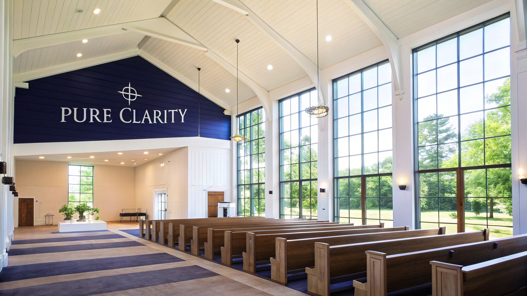
8. Classic Navy and Gold
The Classic Navy and Gold palette offers a sophisticated and dignified aesthetic that speaks of tradition, excellence, and spiritual authority. This timeless combination pairs the stability and depth of deep navy blue with the warmth and richness of metallic gold, creating an atmosphere of refined worship. Often seen in university chapels and denominations with a strong emphasis on theological education, it conveys a sense of intellectual rigor and serene confidence.
This elegant pairing excels in both physical and digital spaces. On social media, navy backgrounds make gold or white text appear crisp and authoritative, perfect for sharing theological insights, quotes from church history, or promoting educational series. It’s one of the most versatile church color palettes for establishing a brand that feels both established and welcoming.
How to Implement This Palette
- For Worship Spaces: Use navy for accent walls, choir robes, or pew cushions. Introduce gold through liturgical vessels, light fixtures, or embroidered details on banners. Balance the palette with warm ivory or soft cream on the main walls to keep the space from feeling too dark.
- For Digital Design: A navy blue background provides a strong, stable canvas for your graphics. Use gold for headlines, logos, or key calls to action to create an immediate sense of importance and quality. Cream or white works best for body text to ensure high readability.
Pro Tip: Soften the formality of this palette by incorporating natural textures. Light wood finishes, indoor plants, and warm ambient lighting can prevent the space from feeling cold and create a more inviting environment.
Managing Your Content Calendar
A sophisticated brand identity like Classic Navy and Gold requires consistent execution across all platforms. You need to ensure every graphic, from event announcements to sermon reels, reflects this polished aesthetic, which can be time-consuming to manage manually.
This is where ChurchSocial.ai simplifies your workflow. Its library of professionally designed graphic templates can be easily customized with your navy and gold palette, ensuring brand consistency with every post. The drag-and-drop calendar makes it easy to schedule all your content in advance, including AI-generated posts and reels from your sermons, maintaining a cohesive and authoritative online presence with minimal effort.
Church Color Palette Comparison Matrix
Bring Your Church's Colors to Life Online
We’ve explored a wide spectrum of powerful church color palettes, from the reverent depth of Traditional Gothic to the clean, aspirational feel of Contemporary Whites. Each palette tells a story and creates a distinct emotional atmosphere. Whether your church identifies with the grounding warmth of Earth Tones or the vibrant energy of Modern Jewel Tones, the key is not just choosing colors, but using them with intention and consistency.
Your color palette is a foundational element of your church's visual identity. It’s a nonverbal cue that communicates your mission, values, and community spirit before a single word is read. A well-executed color scheme builds recognition and trust, ensuring your ministry is instantly familiar whether someone is visiting your website, seeing a post on social media, or attending a service in person. This visual harmony transforms your digital presence from a collection of posts into a cohesive and inviting online home for your congregation.
From Inspiration to Implementation
Translating these beautiful church color palettes from an idea into a consistent digital strategy is the crucial next step. This involves more than just picking hex codes; it requires an understanding of how colors function in a digital space. When translating your church's aesthetic to digital platforms, a deep understanding of how colors interact and influence perception is essential. A great resource for mastering this is learning about color theory in web design, which provides practical guidance on creating visually effective and emotionally resonant online experiences.
To truly bring your brand to life, consider these final action steps:
- Create a Simple Brand Guide: Document your primary and secondary colors, including their hex codes. This ensures anyone creating content for the church can maintain consistency.
- Audit Your Digital Channels: Review your website, social media profiles, and email newsletters. Identify where your new palette can be implemented to create a unified look.
- Equip Your Team: Share the brand guide with volunteers and staff. Explain the "why" behind the colors to foster buy-in and encourage consistent application.
Mastering your church's visual identity online isn't just about aesthetics; it's about effective ministry. A strong, consistent visual brand cuts through the digital noise, making your message clearer and more memorable. It helps you connect with your community, welcome newcomers, and faithfully represent the heart of your church in the ever-expanding digital world.
Ready to apply your new church color palette with ease? ChurchSocial.ai makes it simple to manage and update all your social media from one place. Create AI-generated reels and posts from your sermons, use our graphic templates and editor to design stunning visuals, and plan everything with a simple drag-and-drop calendar. Visit ChurchSocial.ai to streamline your social media and build a beautiful, consistent online presence.