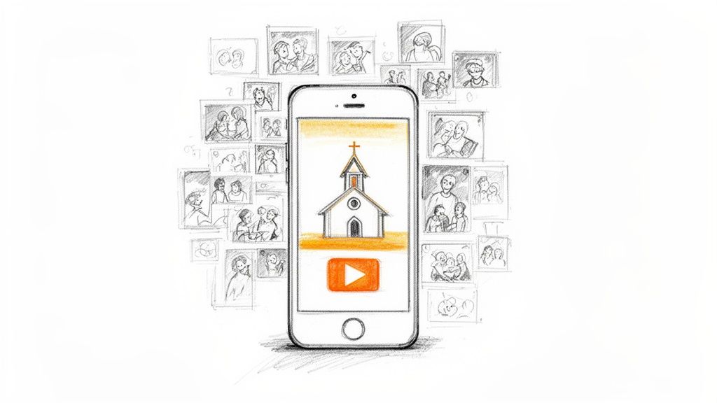
Think about your church's social media feed for a moment. As people scroll endlessly through photos, news, and updates, what makes them stop? More often than not, it's the thumbnail.
An eye-catching thumbnail is your digital welcome mat. It's the single most important visual that decides if someone will watch your sermon clip or just keep on scrolling. A great thumbnail instantly tells a story and can turn a passive scroller into someone ready to engage with your message.
Your Digital Welcome Mat Needs An Eye-Catching Thumbnail
In the world of digital ministry, that first impression is everything. A powerful thumbnail does more than just look nice; it sets an expectation and sparks an emotional connection before your video even starts. For churches, this is a massive opportunity to communicate hope, community, and relevance in a single glance.
This isn't about chasing complicated design trends or hiring a full-time graphic designer. It’s simply about being intentional on platforms like Facebook, YouTube, and Instagram, where visuals are king.
The Power of a First Impression
A well-designed thumbnail isn't just decoration. It serves a few crucial roles for your church’s content:
- Stops the Scroll: A clear, vibrant image paired with easy-to-read text is your best bet for cutting through the noise and grabbing someone's attention.
- Communicates the Message: It gives a sneak peek into the video's topic. Is it a sermon on "Faith Over Fear"? An invitation to your fall festival? The thumbnail should make it obvious.
- Builds Brand Recognition: When your thumbnails have a consistent look and feel, your community will start to recognize your content instantly.
This visual handshake is your best tool for boosting engagement. Just look at the data—on a fast-paced platform like Instagram Reels, optimized visuals can increase engagement by up to 35% compared to posts that just use a random, auto-generated frame. You can dig into similar findings from industry reports by outlets like Social Media Today.
A strong thumbnail can dramatically change how your content performs across different platforms. Each one has its own quirks, but the benefit of a good first impression is universal.
Thumbnail Impact Across Social Media Platforms
As you can see, investing a few minutes in a thumbnail isn't a small detail—it's a strategic move that pays off in real engagement.
The reality for most churches is that time and resources are tight. You can't afford to spend hours designing one graphic for a single video. That's why having a simple, repeatable process is absolutely essential.
Thankfully, creating professional-looking, eye-catching thumbnails is easier than ever. You don't need a big budget or years of design experience anymore.
Tools like ChurchSocial.ai are built to help any staff member or volunteer produce beautiful graphics in minutes. With ChurchSocial.ai, you can create AI-generated Reels from your sermons, create AI-generated content from sermon transcripts like social posts and blogs, use our graphic templates and editor to create and post photos and carousels, and our simple drag-and-drop calendar allows your church to easily manage all of its social media.
Key Principles of Irresistible Thumbnail Design
Let's be real—creating a thumbnail that actually stops the scroll isn't about some secret design magic. It’s about applying a few proven principles. For your church, this means boiling down a sermon series, a message of hope, or a community event into a single, compelling visual that makes people want to click.
The goal is to look both professional and deeply personal. It's an invitation. And it all starts with a simple foundation. Forget getting lost in complex design theory; let's just focus on what works on a crowded screen.
Harness High-Contrast Colors
Your thumbnail is fighting for attention in a never-ending feed. Muted, low-contrast colors will simply fade into the background. To make your text and subject pop, you need to pair a bright color with a dark one.
For a youth group event, think about a vibrant teal background with bold white text. It feels energetic. For a more reflective sermon series, a deep navy blue paired with a soft gold font can create a powerful, respectful mood. The graphics studio in ChurchSocial.ai actually comes with pre-built templates that already nail these high-contrast pairings, giving you a fantastic starting point.
Prioritize Readability with Clear Fonts
People need to read the text on your thumbnail in a split second, especially on a tiny phone screen. This is where simple, bold, and clean fonts become your best friend. Steer clear of overly decorative or scripty fonts that are tough to decipher at a glance.
A good rule of thumb is to stick to three or four words, tops. A title like "Finding Joy in the Journey" is far more effective than "Part 3 of Our Sermon Series on the Book of Philippians." Keep it short, intriguing, and instantly understandable.
This all comes down to mastering Visual Hierarchy in Graphic Design. This principle is what guides a person's eye to the most important element first—in this case, your title.
Create Simple and Focused Compositions
A busy thumbnail is an ignored thumbnail. Your design should have a single, clear focal point. That might be a striking photo of your sanctuary or a simple graphic that represents your topic, paired with that bold text we just talked about.
For instance, if you're promoting an upcoming missions trip, use one clean, high-quality photo of a globe. Don't fall into the trap of creating a collage with ten different pictures from last year. Simplicity guides the eye exactly where you want it to go. We cover more practical tips like this in our guide to effective church graphic design.
And don't forget the specs. We’ve seen that thumbnails optimized for specific platforms see a huge performance lift. For example, a vertical thumbnail for Reels (1080x1920) can outperform standard square ones by as much as 35%. Paying attention to details like this and keeping your main content inside the "safe area" so it doesn't get cropped is a simple way to boost your click-through rate.
A Simple Thumbnail Workflow In ChurchSocial.ai
For churches aiming to create consistently high-quality thumbnails, a streamlined workflow is essential. This process enables church staff and volunteers to produce professional-grade visuals without requiring extensive design experience or significant time investment. Using ChurchSocial.ai, a single sermon can be the source for a full week of social media content.
The foundation of this workflow is utilizing existing sermon content. Instead of a message being confined to a single service, its impact can be amplified across various digital platforms.
From Sermon To Social Media
The process begins with our AI tools. Users can upload a sermon audio or video file, and the AI technology will analyze the content to identify the most compelling and shareable segments. It can automatically generate multiple short video clips (Reels) from your sermon, or create a variety of social posts, blogs, and more directly from the transcript.
This automated step eliminates the need for manual video editing or content writing, saving your church valuable time. The AI produces several optimized clips and posts, preparing them for the design phase where a visual thumbnail is created.
Once the content is ready, the next step is using the Graphics Studio. This is the tool where the thumbnail is designed to capture audience attention and encourage them to engage with the video content.
A great thumbnail is not about complex design but about clear communication. It must quickly convey the value of the video, such as an encouraging message, a key biblical teaching, or an event announcement.
The following diagram illustrates the key components of the thumbnail design process.
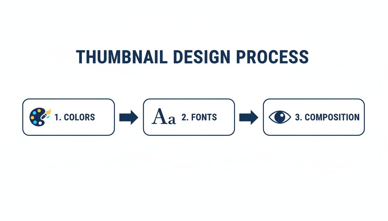
This process centers on three core design principles: colors, fonts, and composition. All of these elements can be managed effectively within the ChurchSocial.ai platform.
Customize With Confidence
Within the Graphics Studio, a branded template can be applied to a sermon clip instantly. The customization tools are designed for ease of use:
- Add Powerful Text: Use a key quote from the sermon transcript as a text overlay on the thumbnail. The text should be concise and impactful.
- Adjust Colors: Modify template colors to align with a specific sermon series or the church's established brand identity.
- Export and Schedule: After finalizing the design, export the graphic and schedule it across multiple social media accounts using our simple drag-and-drop content calendar.
You can learn more about how our Graphics Studio facilitates a fast and simple design process for church teams.
This workflow is also effective for promoting church events. By integrating with Planning Center and other church calendars, you can import event details to create promotional graphics efficiently. For example, a thumbnail for a youth retreat or community food drive can be designed in under five minutes, ensuring professional results for every announcement.
Making Your Thumbnails Work on Every Platform
You’ve designed a fantastic thumbnail for your latest sermon series on YouTube. But when you share that same horizontal image to Instagram Reels, it gets awkwardly cropped, and the text is unreadable. Sound familiar?
Creating eye catching thumbnails isn't just about a great design; it's about making that design work for each specific social media platform. What grabs attention on a desktop screen will get lost in a fast-scrolling vertical feed. This isn’t about creating more work—it's about making sure the work you're already doing actually gets seen.
A few simple tweaks can mean the difference between someone stopping to watch and someone scrolling right past.

To make things even easier, here's a quick cheat sheet with the most common sizes you'll need.
Social Media Thumbnail Size and Ratio Cheat Sheet (2026)
This table is your go-to reference for the most common thumbnail dimensions and aspect ratios for church social media content.
Keep this handy, and you'll never have to second-guess your canvas size again.
A Quick Look at Each Platform
You have to think about how people use each app. Someone on YouTube is leaning in, ready to commit a few minutes. Someone on Reels is just killing time, swiping at lightning speed. Your design needs to match that energy.
YouTube (16:9 ratio): This is your classic landscape view, usually seen on a larger screen. You have more real estate to work with here. Feel free to include the sermon title and a compelling image that doesn't include people, like an empty sanctuary or abstract art. Clarity and detail are your friends on YouTube.
Instagram & Facebook Reels (9:16 ratio): It’s all vertical, all the time. The scroll is fast, so your message needs to be faster. Think big, bold text—three or four words, tops. The goal is to stop the thumb with a single, powerful visual.
Square Feed Posts (1:1 ratio): This is your bread and butter for daily posts on Instagram and Facebook. It’s perfect for a Bible verse graphic, an event announcement, or a ministry spotlight. The key is balance; centering your main elements makes them look neat and professional in the grid.
Let's say you're using a tool like ChurchSocial.ai to generate clips from your latest sermon. You’d create a detailed 1920x1080 thumbnail for the full YouTube video. Then, for the Reel, you’d pop into the graphics studio and create a vertical version with punchier text. That small change makes a huge difference—we've seen Reels with optimized thumbnails get 22-35% higher engagement.
The big takeaway is that one size never fits all. When you tailor your thumbnails for each platform, you avoid awkward cropping and make sure your message is always clear and professional. It’s a simple step that has a massive impact.
Measuring and Improving Your Thumbnail Performance
So you’ve created a fantastic thumbnail. That’s a huge first step! But the real growth for your church’s ministry online happens when you start to understand what’s actually connecting with people.
This isn’t about getting lost in complicated analytics spreadsheets. It's simply about listening. Your community tells you what they care about through their clicks, likes, and comments. Paying attention to that feedback is how you turn a social media feed from a list of announcements into a real conversation.
Listening to Your Numbers
You don’t have to be a data expert to figure out what's working. Most social platforms give you simple, clear metrics that tell a powerful story. In fact, you can see a clean overview of how your posts are doing right inside your ChurchSocial.ai content calendar.
To get started, just focus on a few key things:
- Click-Through Rate (CTR): This is a big one. It's the percentage of people who saw your post and felt compelled enough to actually click. A high CTR tells you the thumbnail and title did their job and grabbed someone's attention.
- Engagement Rate: This bucket includes all the likes, comments, and shares. High engagement is great because it means your post didn't just earn a click—it sparked a genuine reaction.
- Watch Time (for videos): This is crucial for platforms like YouTube. It shows how long people stick around after they click. A great thumbnail gets them in the door, but great content is what makes them stay.
Think of these numbers as direct feedback. If a sermon clip gets a high CTR but the watch time is super low, it might mean the thumbnail promised something the video didn't deliver. On the flip side, if a video has amazing watch time but a low CTR, you know the content is solid—it’s the thumbnail that needs a little more work to get people to click in the first place.
Run Simple Tests to See What Resonates
One of the best ways to learn is to test different ideas against each other. It sounds technical, but A/B testing is actually pretty simple. You’re just comparing two versions of something to see which one your audience prefers.
The goal of testing isn't to find one 'perfect' thumbnail forever. It's about developing an intuition for what your specific community responds to, allowing you to make smarter design choices over time.
For instance, after ChurchSocial.ai generates a sermon clip for you, jump into the Graphics Studio and create two different thumbnails for it. Post one this week and the other next week. You could even post them to different platforms at the same time. Then, just watch to see which one gets more clicks and sparks more conversation.
Here are a few easy A/B test ideas you can try right away:
- Question vs. Statement: For a sermon about hope, you could test a thumbnail that asks, "Where Do You Find Hope?" against another that states, "Finding Hope in Hard Times." Does a question or a statement make people more curious?
- Graphic vs. Photo: Try comparing a simple, text-focused graphic against a thumbnail that uses a high-quality photo—maybe of your sanctuary or a meaningful object like an open Bible.
- Color Schemes: Test your standard church branding colors against a bolder, more high-contrast palette for a special series or event. See if a different look grabs more attention.
With the drag-and-drop calendar in ChurchSocial.ai, you can schedule these tests and easily check their performance side-by-side. This simple rhythm of testing, measuring, and adjusting is what will consistently improve your online outreach.
If you want to go a step further, learning more about what social media analytics can reveal can be incredibly helpful. This approach helps even the busiest ministry leader make informed decisions that maximize their impact.
Answering Your Top Thumbnail Questions
Even after you've got the tools and a bit of a plan, a few questions always seem to pop up when you start creating thumbnails. We get it. Here are some quick, practical answers to the most common ones we hear from ministry leaders, designed to help you move forward with confidence.
How Much Text Is Too Much?
We've all seen those thumbnails packed with text. The truth is, they don't work. A great rule of thumb is to stick to three to five powerful words. Seriously, that's it.
Your goal isn't to cram the whole sermon summary onto the image; it's to spark curiosity. Think of it as a hook, not a paragraph. A title like "Finding Hope" is so much more intriguing than "Our Sermon This Week on Finding Hope in Difficult Times." Your community is scrolling fast, and that text has to connect in a split second. The templates inside ChurchSocial.ai are built for this, using clear, bold fonts that are easy to read even on a tiny phone screen.
What If We Don’t Have Good Photos?
This is probably the biggest hurdle we hear about, but it’s definitely not a dealbreaker. You don't always need a professional photoshoot to create an eye-catching thumbnail. Not by a long shot. In fact, it's often better to avoid using images of people altogether.
If you’re stuck, here are a few things you can try right inside the ChurchSocial.ai Graphics Studio:
- Go with an Abstract Background: Sometimes, a simple, high-contrast background with bold text is all you need. A subtle gradient using your church’s brand colors or a clean texture can look incredibly sharp.
- Use Icons and Symbols: Talking about growth? A simple leaf icon instantly communicates the theme. A series on prayer? An open Bible works perfectly. Visual cues can do a lot of the heavy lifting.
- Let Typography Be the Star: Don't underestimate the power of great fonts. A well-designed typographic thumbnail, where the text is the main design element, can feel modern and incredibly professional.
Our platform gives you a whole library of design elements and templates that don't depend on having the perfect photo, so you're never starting from a blank slate.
Should Our Thumbnails Always Look The Same?
Yes and no. You absolutely want consistency for brand recognition—people should be able to spot your content in a crowded feed. But you don't want it to become so repetitive that it's just boring.
The secret is to create a consistent framework, not a rigid, identical template. This just means you're always using the same one or two fonts, pulling from your church's color palette, and maybe placing your logo in the same spot every time.
Within that simple framework, you have total freedom to swap out the background image, change the main headline, or use a different icon for each video. It strikes that perfect balance: your brand is instantly recognizable, but the content still feels fresh and dynamic.
With global social media users soaring past 5.2 billion, your thumbnail is your single most important first impression. The data doesn't lie: short-form videos on platforms like YouTube Shorts and Reels are racking up over 120 billion daily views, and posts with strong visuals see 35% higher engagement on Instagram. You can dig into more of this data by exploring the latest 2026 social media benchmarks.
This is where having a system makes all the difference. With ChurchSocial.ai, you can save your branded templates and then quickly spin up new versions for every sermon clip or event announcement. It's brand consistency without sacrificing an ounce of creativity.
Ready to finally stop the scroll and get your message in front of more people? ChurchSocial.ai gives you all the tools you need—from AI-powered sermon clips to easy-to-use design templates and a simple drag-and-drop calendar. Start creating professional, eye-catching thumbnails in minutes and watch your online ministry grow. Get started today at https://churchsocial.ai.