Saturday evening is when a lot of church bulletin graphics get made. The sermon title just changed, the youth event date needs one more correction, and somebody still has last month's flyer pasted into the template. If you've ever opened a blank document and tried to make it all feel clear, current, and worth reading by Sunday morning, you're not behind. You're doing what church communicators have done for years with limited time and too many moving parts.
The problem usually isn't effort. It's workflow. Most churches still treat the bulletin as a separate weekly task instead of part of one communication system. That's why the design feels rushed, the social post doesn't match the handout, and the website banner looks like it came from a different church entirely.
Strong church bulletin graphics fix more than appearance. They help people find what matters fast, trust what they're seeing, and recognize your church whether they're holding a printed bulletin, opening an email, or scrolling Instagram after lunch.
Why Your Bulletin Graphics Still Matter in 2026
The printed bulletin still has a job to do, even in a church that streams services, posts reels, and sends emails during the week. Church bulletins have been a cornerstone of communication since the early 20th century, and despite a 40% rise in online newsletters since 2020, 68% of churches continue to rely on traditional bulletins because they reach members across age groups more reliably than digital-only alternatives, according to Dazzle Printing's church bulletin design overview.
That tracks with what church staff already know. The bulletin reaches the member who never checks email, the guest who wants a simple next step, the parent who needs children's ministry info in hand, and the senior adult who reads the service notes during the sermon. It's not old-fashioned. It's practical.
The bulletin is still the handoff point
A bulletin is often the first physical piece of communication someone receives on campus. That matters. If it looks cluttered, outdated, or inconsistent with everything else your church publishes, people feel that before they process a single announcement.
A good bulletin doesn't try to carry every ministry update in the building. It gives people orientation.
- Guests need confidence: They want service basics, key contact points, and a clean path to connect.
- Regular attenders need clarity: They're scanning for dates, sermon emphasis, and the next action.
- Volunteers need consistency: They need a format that doesn't force a redesign every Saturday.
The churches that communicate calmly on Sunday usually made design decisions before Sunday.
Design changes how people use the bulletin
When teams think of bulletin graphics as decoration, they usually overfill the page with text and add an image at the end. That almost never works. The graphic should lead the eye, support the message, and make the page easier to scan.
That's why church bulletin graphics matter. They aren't just there to make the page pretty. They reduce confusion, reinforce the sermon series, and create continuity with screens, email headers, and social posts. For a small or mid-sized church, that kind of continuity can make a ministry look more organized than its staffing implies.
The Foundations of Effective Bulletin Design
Most bulletin problems aren't software problems. They're layout problems. If the design is hard to scan, no tool will rescue it.
Visuals also carry more weight than many churches assume. Visuals capture 88% more attention than text alone, and 75% of visitors judge a church's trustworthiness and credibility based on visual polish, according to Ekklesia 360's church communications statistics.
Start with hierarchy, not decoration
People don't read bulletins top to bottom. They scan. So the page has to tell them what matters first.
Put one thing in the lead position. Usually that's the sermon series visual, the welcome block, or the main next step. Everything else should sit underneath it in descending importance. If three sections all fight for attention with bold type, boxes, and bright color, none of them wins.
A simple way to check hierarchy is this: glance at the page for three seconds. If you can't tell what to read first, the design needs work.
Use fewer fonts and bigger type
Church bulletins serve teenagers, parents, and older adults in the same piece. That means legibility beats style every time.
Keep it simple:
- Choose one headline font: Use it for series titles and section labels.
- Choose one body font: Use it for announcements, notes, and supporting details.
- Protect reading comfort: If body text feels cramped on screen while you're editing, it will feel worse in print.
Let color support the message
Color should organize the page, not compete with it. Your church colors can do that well. So can seasonal or liturgical cues, when they fit your tradition. The goal is recognition.
If your bulletin uses one set of colors, your slides use another, and your social graphics use a third, your church looks fragmented even when the content is solid. That's why it helps to maintain a simple design system. If you need help building one, this guide to church graphic design basics is a useful starting point.
Practical rule: If a background color makes black text harder to read, the color is serving the design instead of the reader.
White space is ministry, too
White space isn't wasted space. It gives people room to think and helps key information stand out. Churches often fear an empty corner in the layout, then fill it with clip art, extra lines, or a paragraph nobody asked to read.
What works better is restraint. Keep margins generous. Separate unrelated items. Let the sermon title breathe. A clean bulletin feels easier to trust because it feels easier to use.
Creating Graphics with Modern Tools and Templates
The hard part of church bulletin graphics usually isn't creativity. It's repeatability. You need something that looks polished this week, next week, and six sermon series from now, even when a volunteer is building it between other ministry tasks.
That's why templates matter. They reduce decisions. They also protect your church from the weekly redesign spiral, where every bulletin starts from scratch and ends with a slightly different logo, font pairing, and announcement structure.
Common church bulletin graphic dimensions
You don't need a design degree to get the specs right. You do need consistency between what you print and what you share digitally.
| Bulletin Format | Print Size (inches) | Digital Dimension (pixels) |
|---|---|---|
| Half-page bulletin | 5.5 x 8.5 | 1650 x 2550 |
| Full-page bulletin | 8.5 x 11 | 2550 x 3300 |
| Tri-fold cover panel | 3.67 x 8.5 | 1101 x 2550 |
| Social preview graphic from bulletin art | 1080 x 1080 equivalent crop | 1080 x 1080 |
For print, export a high-resolution PDF when possible. For digital sharing, use an image size that fits the platform where the bulletin cover or announcement will appear. If your team emails a bulletin PDF and also posts the sermon graphic online, make both from the same source file so the branding stays intact.
Templates save more than time
Canva, Adobe Express, and GIMP can all handle church bulletin graphics. Each has a place. Canva is easy for volunteers. Adobe Express works well for fast branded edits. GIMP is useful when budget matters and someone on your team is comfortable with a more hands-on tool.
The trade-off is context. Generic design tools don't know your preaching calendar, event schedule, or church voice. They help you make a layout, but they don't remove the communication work behind it.
That's where integrated church tools change the process. Searches for “AI church bulletin maker” spiked 320% year over year in May 2025, and a 2026 Lifeway Research report noted that 55% of churches plan AI adoption for visuals while 72% struggle with theologically relevant content, as summarized by LPi's article on church art and design trends. The issue isn't whether churches will use AI. It's whether the output fits the church.
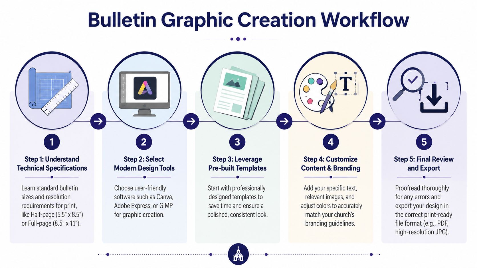
What a better workflow looks like
A useful bulletin process starts with ministry content, not design software. Sermon title, series theme, key announcement, event details, and brand elements should all be ready before anyone starts dragging boxes around.
Then build from a repeatable sequence:
- Pull the core message first: Sermon series title, passage, and one main visual direction.
- Use a stable template: Keep structure fixed and swap content, not layouts.
- Create one master graphic: Bulletin cover first. Then adapt.
- Export for print and digital: Don't rebuild the same art twice.
- Proof before posting and printing: Dates, names, and readability matter more than effects.
If your church wants templates built for ministry content instead of generic marketing use, a library of free church graphics templates can shorten setup time. In the same category, ChurchSocial.ai combines templates, a graphics editor, sermon-based content creation, calendar scheduling, and Planning Center-connected event workflows so a church can move from sermon or event details to matching bulletin and social assets in one system.
If your tool saves time but creates off-brand or theologically vague graphics, it isn't saving time. It's moving the revision work later.
Ensuring Graphics Are Accessible and On-Brand
A lot of churches assume accessibility only applies to websites. That's a costly assumption. If your bulletin gets emailed as a PDF, uploaded to an app, or posted on social media, accessibility becomes part of bulletin design.
The gap is bigger than many teams realize. A 2025 Barna Group study found that 68% of U.S. congregations distribute bulletins online, yet only 12% implement accessibility features, which may exclude 15% to 20% of congregants with disabilities, as described by ChurchArt's accessibility discussion.
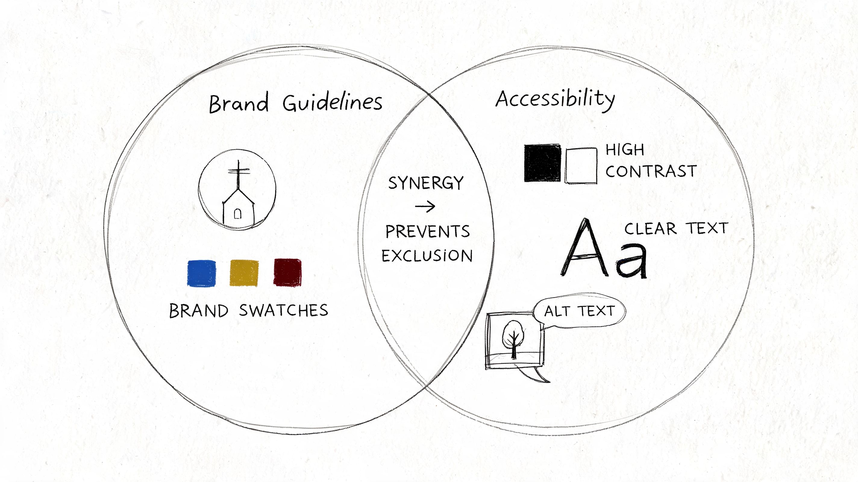
Accessibility is not optional polish
If light gray text sits on a cream background, some people won't read it. If your PDF is just an image with no readable structure, some people won't access it well. If your headline font looks elegant but breaks apart at smaller sizes, some people will give up before they reach the announcement.
Small fixes make a real difference:
- Increase contrast: Dark text on light backgrounds usually wins.
- Use readable fonts: Decorative type belongs in short headings, not body copy.
- Keep alignment clean: Left-aligned text is easier to scan than centered paragraphs.
- Add useful descriptions online: If bulletin art is shared digitally, descriptive text helps people understand what's there.
Brand consistency helps accessibility
Branding and accessibility aren't competing goals. In healthy church communication, they support each other. Consistent colors, type choices, and logo use help people know they're in the right place. Accessible choices help more people stay there.
That principle shows up outside church media too. In printed design work like event signage or worship visuals, the strongest pieces usually combine clarity with recognizable identity. Even a practical design walkthrough like this Custom Bass Drum Heads tutorial is a helpful reminder that readable placement, restrained text use, and intentional visual hierarchy matter whenever a design needs to be seen from a distance or understood quickly.
A church bulletin can be beautiful without making anyone work hard to read it.
Repurposing Bulletin Art for Digital Outreach
The smartest church bulletin graphics don't end on paper Sunday at noon. They keep working all week.
That shift changes how you design. Instead of asking, “What do we need for the bulletin?” ask, “What visual do we need everywhere?” That one question usually leads to better creative decisions because it forces the team to think in systems, not isolated files.
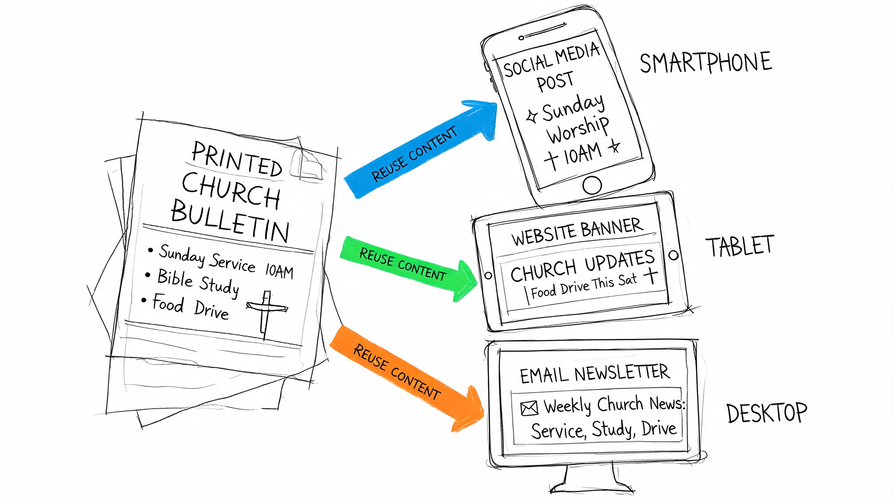
One graphic, several uses
A sermon series image can become all of this with minor edits:
- Bulletin cover: Full title, date, and service info
- Announcement slide: Same artwork with less text
- Instagram square: Title plus one short line
- Story or reel cover: Vertical crop with stronger contrast
- Email header: Wide crop for weekly newsletter
- Website hero or event block: Matching visual for current emphasis
The mistake many churches make is designing each asset separately. That creates inconsistency and burns volunteer time. Start with one master file, then crop and simplify based on channel.
Build around the sermon and calendar
The bulletin is one expression of the week's ministry focus. The sermon provides language. The church calendar provides timing. The event system provides details. Once those are connected, your bulletin art becomes the source for nearly everything else.
A practical weekly rhythm looks like this:
- Early week: Confirm sermon title, key passage, and event priorities.
- Midweek: Build the master visual and bulletin layout.
- Late week: Resize that art for social, email, and screens.
- Weekend: Publish and schedule the matching digital assets.
If your team has ever rebuilt the same event graphic four times in four tools, the problem isn't talent. It's fragmentation. A connected workflow turns one approved graphic into a week of aligned communication. For more ideas on that process, this guide on how to repurpose content is worth bookmarking.
Keep the art simple enough to travel
Not every bulletin design repurposes well. Dense layouts with multiple announcement blocks usually collapse on mobile. A cleaner visual travels better.
Use these filters before finalizing the art:
- Can this crop vertically without losing the message?
- Does the title still read at phone size?
- Can I remove half the text and still keep the point?
- Will this still feel like our church on Instagram or YouTube?
If the answer is no, simplify before you print. The churches that look consistent online usually designed for reuse from the beginning.
Building Your Integrated Communication Flywheel
A church bulletin shouldn't sit in its own lane. It should be part of a communication flywheel that starts with the sermon and keeps turning through the week.
The sermon gives you language, themes, and tone. From there, the same ministry content can shape bulletin graphics, social posts, email headers, announcement slides, blog drafts, and short-form video clips. When those pieces match, the church feels coherent. When they don't, every channel creates more work for the next one.
What the flywheel changes
Instead of starting over each week, your team starts with one source and multiplies it. That lowers decision fatigue and makes quality easier to maintain.
A healthy flywheel usually has these marks:
- One message base: Sermon or event details drive the week's creative.
- One visual system: Fonts, colors, and image style stay aligned.
- One publishing rhythm: Print and digital support each other instead of competing.
- One review habit: Proof once, then distribute with confidence.
This approach serves small churches especially well. You may not have a designer, videographer, writer, and social manager. You may have one staff member and one dependable volunteer. A connected system makes that enough.
If your church is tired of building bulletins, posts, reels, and event graphics in separate tools, ChurchSocial.ai is worth a serious look. It helps churches turn sermons into social content, create branded graphics, plan posts on a drag-and-drop calendar, and connect event details from tools like Planning Center so the same ministry message can flow from Sunday's bulletin into the rest of the week.