It's Sunday morning. A stack of bulletins sits by the door, the worship slides are loaded, and somebody is still asking whether the women's Bible study starts this Tuesday or next. That's the moment most churches realize the bulletin isn't just a handout. It's a trust test.
If the bulletin is clean, current, and easy to follow, people use it. If it's cluttered, outdated, or full of errors, it creates friction. People miss signups, show up at the wrong time, or stop treating church communications as reliable. That matters because parish bulletins still get read at a very high rate. A 2023 CARA study summarized by 4LPI found that 90% of weekly Mass attendees read their parish bulletin, with 46% preferring print-only versions.
That one fact should change how most churches treat bulletin prep. This isn't a side task you squeeze in late Thursday night. It's one of your most visible ministry tools.
The bigger opportunity is this. Your bulletin shouldn't be the final product. It should be the starting point for a connected communication system that feeds your website, email, social posts, event promotion, and weekly follow-up. That's where a platform like ChurchSocial.ai helps. Instead of recreating the same announcement five different ways, you can turn one approved message into coordinated content across your channels.
1. Outdated or Irrelevant Information
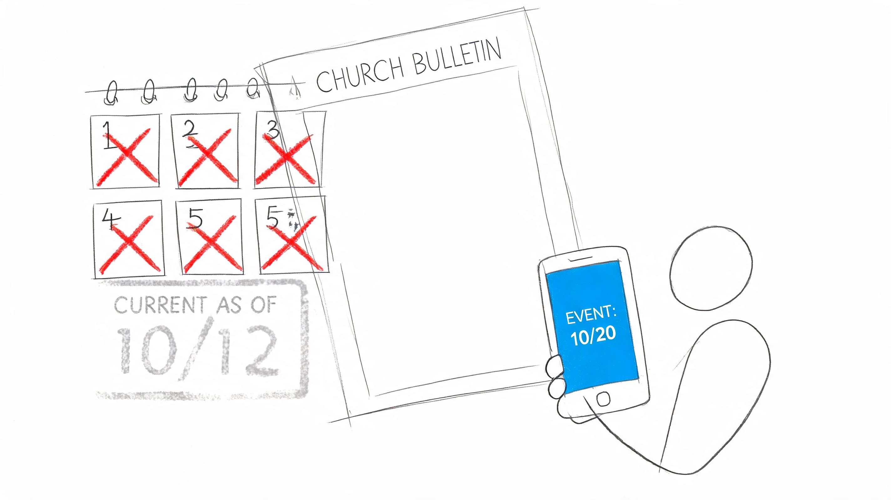
Nothing tanks confidence faster than stale information. If your bulletin still lists last month's event, a retired staff contact, or the wrong room for children's ministry, people stop trusting the rest of the page too.
This mistake usually comes from a broken workflow, not bad intentions. Churches often recycle old files, copy last week's bulletin into a new draft, and keep moving. That works until old content survives three rounds longer than it should.
A common example is the event that never dies. Vacation Bible School stays in the announcements long after summer ends. A ministry signup remains in print after registration closes. A phone number for someone who no longer leads the ministry keeps getting reused because nobody owns the final review.
Build one source of truth
The fix is simple, but it requires discipline. Keep one master calendar and one approved announcement list. If your ministry leaders send updates through email, text, hallway conversations, and Sunday morning verbal reminders, your bulletin will always lag behind reality.
Use your print bulletin as a weekly snapshot, not your only communication channel. ChurchSocial.ai works best when churches treat approved calendar details as the base layer, then push timely updates to social media, Reels, stories, and event posts as details change.
Practical rule: If an announcement can expire, it needs an owner and an end date.
A few habits help immediately:
- Assign one final editor: One person should verify dates, names, and links before anything is printed or scheduled.
- Stamp your timing clearly: Add language that shows the bulletin reflects current information for that week, especially when details may shift.
- Sync events centrally: If your church already uses Planning Center or another event calendar, use that as the system of record, then pull from it consistently.
- Push updates digitally: When weather, room assignments, or signup status changes, update social channels and digital posts first instead of waiting for next Sunday.
Church bulletin mistakes in this category don't look dramatic. They look small. But small inaccuracies train people to double-check everything you publish, and that's a problem you don't want.
2. Poor Visual Design and Readability
A busy bulletin feels harder than it should. Too many fonts, weak spacing, random clipart, and dense blocks of text make readers work to find the one thing they need.
Many churches confuse fullness with usefulness. Filling every inch of space doesn't make the bulletin more valuable. It makes it less scannable.
I've seen bulletins where worship times, funeral notices, volunteer needs, and special events all had the same visual weight. Nothing stood out because everything was shouting.
Make the page easy to scan
Your layout should tell the reader what matters before they read a single sentence. That means consistent type choices, clear spacing, and a visual hierarchy that points attention to the most important items first.
If your team needs help tightening that up, the guidance in church graphic design best practices is a good place to start. The same principles that improve sermon graphics and social posts also make your bulletin easier to use.
A better bulletin usually follows a few simple rules:
- Limit font choices: One heading font and one body font is enough for most churches.
- Use white space on purpose: Empty space separates ideas and helps older readers scan faster.
- Create hierarchy: Service times, major events, and next steps should visually outrank minor reminders.
- Keep branding consistent: Colors, logo use, and style should match your website and social channels.
Good bulletin design doesn't mean “fancy.” It means people can find what they need in seconds.
Churches often underestimate how much design affects credibility. If the bulletin looks improvised every week, guests assume the communication process is improvised too. A clean template removes that impression fast.
ChurchSocial.ai helps here because the same template thinking can carry across your bulletin graphics, announcement slides, and social content. When your print piece and your digital content look related, people recognize your church faster and trust the message more.
3. Information Overload and Missing Hierarchy
Some church bulletins fail because they try to be complete. They include every ministry update, every class, every appeal, every note of gratitude, every meeting reminder, and every schedule detail in one place.
The result is predictable. The reader skims, feels overloaded, and misses the few things that mattered this week.
There's a practical reason to simplify. A rapid survey discussed by Be Known For Something said approximately 70% of congregations completely waste their church bulletins, with only 1/3 using them effectively for core communication purposes. That aligns with what many church communicators already know. Long paragraphs and equal-weight announcements make bulletins easy to ignore.
Decide what deserves top billing
Not everything belongs on page one. Not everything belongs in print. And not every ministry announcement deserves the same treatment.
Break your content into priority levels so your team can make decisions faster:
- Critical items: Service time changes, safety updates, closures, major schedule shifts
- Important items: Big churchwide events, ministry launch dates, registration deadlines
- Standard items: Ongoing classes, recurring groups, regular volunteer reminders
- Reference items: Staff contacts, giving info, website details, ministry directories
When churches don't define these categories, every ministry argues that its announcement is urgent. The bulletin becomes a compromise document instead of a communication tool.
Use each channel for what it does best
Print is good for stable, scannable information. Social media is better for emphasis, repetition, and urgency. Email works better for fuller details. Your website should hold the expanded version.
That's why a dynamic workflow matters. Use ChurchSocial.ai to take the top items from the bulletin and spread them through the week as separate posts, graphics, story slides, or short video reminders. Don't post one giant bulletin image and expect people to sort through it on their own.
A bulletin should answer, “What do I need to know right now?” If it tries to answer everything, it usually answers nothing well.
4. Inconsistent Contact Information and Call-to-Action Clarity
A weak announcement often isn't weak because the event is unimportant. It's weak because nobody knows what to do next.
“Sign up in the lobby” sounds clear until a first-time guest asks which lobby table, who they should talk to, or whether there's still space. “Contact the church office” sounds simple until the office number is outdated or the email routes nowhere.
Church bulletin mistakes in this area reduce participation. People won't chase a confusing next step for long. If the path to action feels fuzzy, they move on.
Every announcement needs one clear next move
A youth retreat announcement should tell people exactly how to register. A volunteer request should tell them who to contact and what role needs filling. A class invitation should say when it starts, where it meets, and whether childcare is available.
Here's the standard I recommend. Every actionable announcement should answer these questions:
- What is it?
- Who is it for?
- What do you want the reader to do?
- By when?
- Where should they go or who should they contact?
If one of those pieces is missing, expect drop-off.
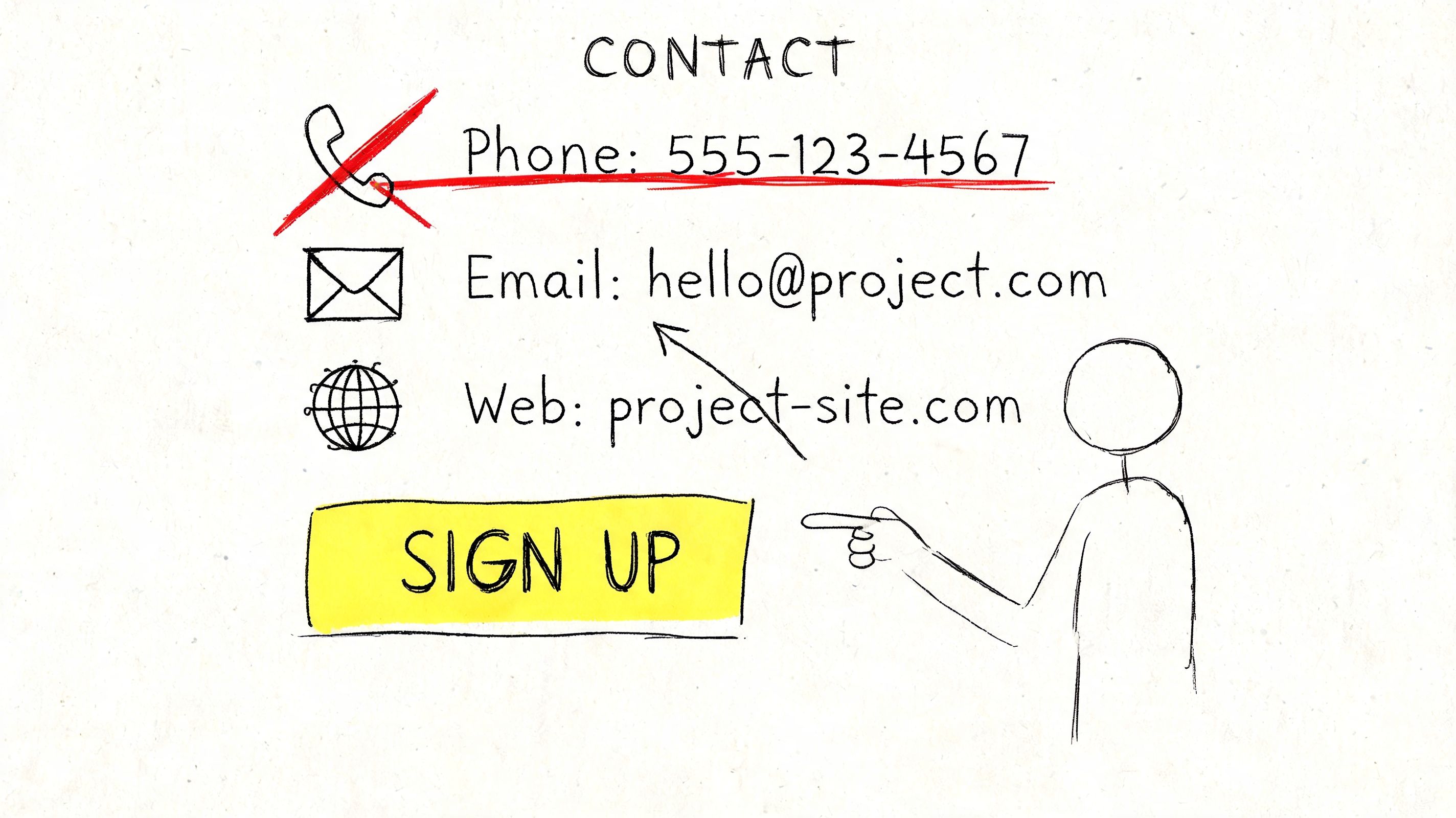
Standardize your CTA format
Most churches improve quickly once they stop improvising announcement language. Use a repeatable structure such as: “To register, contact [name] at [email]” or “Sign up at [specific page].” Keep it direct.
Field note: One announcement, one action. If you ask people to email, call, scan, visit the lobby, and talk to a pastor, most won't do any of them.
This is another place where digital workflow helps. If your church uses ChurchSocial.ai alongside Planning Center or another calendar, you can keep signup language and event references consistent across the bulletin, social posts, and follow-up reminders. That reduces the chance that print says one thing while Instagram says another.
5. Failing to Adapt Content for Different Platforms and Audiences
A bulletin announcement is not a Facebook post. It's not an Instagram caption. It's not an email newsletter. And it definitely isn't a Reel script.
Churches lose traction when they copy the exact same chunk of text into every platform and hope for the best. The message may be accurate, but the format is wrong for how people consume it.
A printed bulletin can carry more detail because people expect to hold it and scan it. Instagram needs strong visuals and short copy. Facebook can carry more context, but still needs structure. Short-form video needs a clear hook and a single point.
Repurpose, don't duplicate
The better approach is adaptation. Start with one approved announcement, then rebuild it to fit the channel.
If you want a practical framework, how to repurpose content for church communications lays out the mindset well. You're not creating from scratch every time. You're shaping the same core message for different use cases.
A few examples make the difference clear:
- Print bulletin: Full event facts, times, room details, registration path
- Instagram post: One strong visual and a short invitation
- Instagram Story: Countdown sticker or quick reminder for deadline-based events
- Facebook post: Event summary plus a direct link or RSVP prompt
- Short video: Pastor or ministry leader gives one reason to attend
- Email: Expanded details with links and key next steps
ChurchSocial.ai is especially useful here because it turns one approved content source into multiple outputs. A sermon transcript can become social posts, blog content, or clips. An event entry can become a designed announcement graphic. That saves your team from rewriting everything manually.
Match the audience, not just the message
A senior adult luncheon and a youth worship night shouldn't sound the same. The facts may follow the same structure, but the tone and format should fit the people you're trying to reach.
Churches that adapt content well usually stop seeing the bulletin as the whole communication plan. It becomes the source document that feeds the week.
6. Grammatical Errors, Typos, and Proofreading Failures
Typos are easy to dismiss until one changes the meaning of the sentence, misspells a volunteer's name, or sends people to the wrong date. Then it's not funny. It's embarrassing.
The church world has a long history of bulletin bloopers because these mistakes are common and memorable. Collections like ProofreadingServices.com's church bulletin typo roundup have cataloged examples for years, including lines where a missing word changed the announcement completely. People laugh because they've seen versions of this happen in real life.
The problem isn't only humor. Repeated sloppiness tells people nobody slowed down enough to check the details.
Proofreading needs a process, not a hope
Most proofreading failures happen because the writer is also the final reviewer. By the time you've read the same announcement six times, your brain fills in missing words and skips over obvious errors.
Use a simple review chain:
- Writer reviews for meaning: Is the announcement clear and complete?
- Second reader reviews for accuracy: Dates, names, phone numbers, links, and spelling
- Final preview checks formatting: Line breaks, bolding, consistency, and visual flow
Read important announcements out loud. That catches awkward phrasing fast. For names and event details, ask the ministry leader to confirm the final wording before publication.
“The Fasting & Prayer Conference includes meals” is funny online. It's not the category your church wants to join.
A church style guide provides more value than many groups anticipate. Decide how you write ministry names, whether you abbreviate months, how you format times, and how you handle scripture references. That way each week doesn't become a fresh argument about presentation.
ChurchSocial.ai can help reduce repetitive formatting issues because templates and scheduled workflows create consistency. But no tool replaces a final human proofread. The best system is software plus a careful second set of eyes.
7. Neglecting Mobile-Friendly Design and Accessibility
Many churches still design announcements as if everyone will read them on paper or on a full desktop screen. That's no longer safe. If your digital bulletin is painful to read on a phone, many people won't read it at all.
This usually shows up in predictable ways. Tiny text in a PDF. Long narrow pages that require zooming. Social graphics packed with so much copy that the text turns illegible on mobile. Links that are difficult to tap. Color choices that look nice on a laptop but become unreadable on a small screen.
Design for the smallest screen first
If your church posts a bulletin online, open it on an actual phone before you publish it. Not in theory. On a real device, with normal lighting, using your thumb.
That quick test exposes problems immediately. If someone has to pinch and zoom just to find service times, the format is working against you.
A few standards make a big difference:
- Use larger body text: Especially for older readers who may already struggle with small type
- Choose strong contrast: Dark text on a light background is still the safest choice for readability
- Break up dense blocks: Short sections are easier to scan on screens
- Avoid text-heavy image posts: Use graphics for highlights, then put fuller detail in the caption or linked page
- Add alt text where possible: Especially on social posts and website images that carry essential information
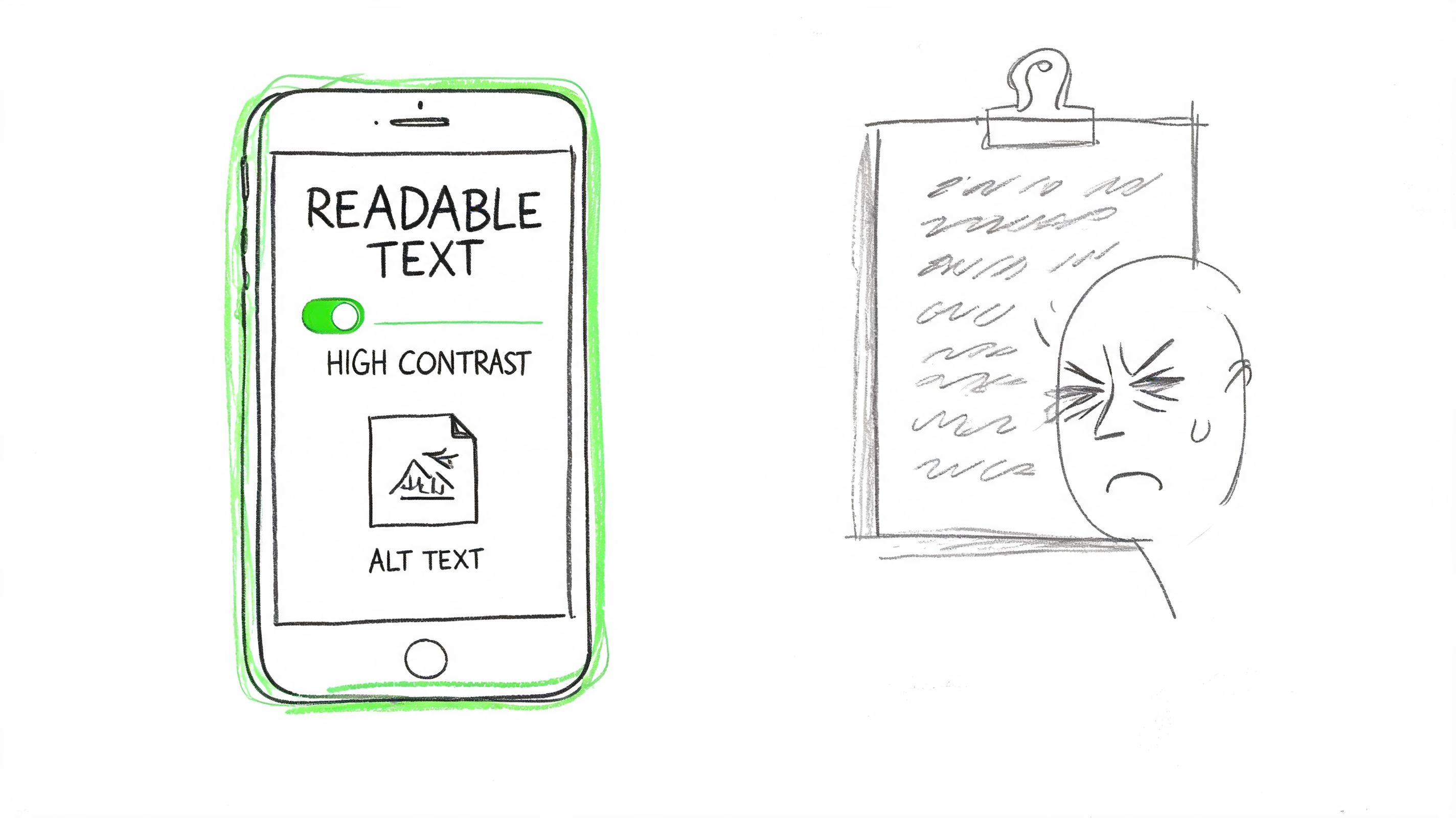
Accessibility is pastoral care
Accessibility isn't just a technical standard. It's part of serving your congregation well. If an older member can't read the email bulletin or a visually impaired user can't access event details online, your church has created an unnecessary barrier.
ChurchSocial.ai helps by giving churches more flexible ways to publish content than a static PDF alone. Instead of forcing everything into one bulletin file, you can post accessible graphics, video updates, shorter captions, and linked event content in formats people can easily use.
8. Missed Opportunities to Drive Action and Engagement
Some bulletins are accurate, readable, and polished, but still underperform because they stop at information. They announce. They don't invite.
That's a missed ministry opportunity. Church communication should move people toward participation, not just awareness.
A bulletin item about serving in kids ministry should ask for a response. A prayer update should invite prayer. A church event post should make it easy to RSVP, comment, share, or ask a question. If the message doesn't create a next step, many people will appreciate it and do nothing.
Move from passive notices to active response
Churches can learn a lot from digital communication habits. Strong online ministry content often includes a clear response path, which is one reason building community through engaging digital content matters so much for modern church outreach.
Your bulletin and your social plan should work together. Print can introduce the opportunity. Digital can reinforce it through reminders, signup links, clips, Stories, and follow-up prompts.
Use action language that removes ambiguity:
- Invite a direct response: “Sign up today” works better than “More information available”
- Ask for interaction: “Comment with your prayer request” is stronger than posting a prayer list with no invitation
- Use trackable links: Point people to a clear registration or interest form
- Create feedback loops: Ask what people need, what they attended, or what they want to learn more about
The ChurchSocial.ai article on engagement in church communications is useful here because it pushes beyond posting for appearance's sake. Churches need content that leads somewhere.
Turn one weekly bulletin into a week of engagement
A sermon can become clips and discussion prompts. An event can become a reminder post, a countdown Story, a registration graphic, and a recap. A service project can become a volunteer ask before the event and a celebration afterward.
That shift matters because ChurchSocial.ai isn't just a design tool. It's a planning hub. When your bulletin feeds a drag-and-drop content calendar instead of dying on a rack by the door, your communication starts working harder for your ministry.
8 Common Church Bulletin Mistakes Compared
| Item | 🔄 Implementation complexity | ⚡ Resource requirements | ⭐ Expected outcomes | 📊 Ideal use cases | 💡 Key advantages |
|---|---|---|---|---|---|
| Outdated or Irrelevant Information | Medium, needs review workflow and calendar sync | Moderate, staff time + integration tools (calendar sync) | Improved accuracy and trust; fewer attendee errors | Weekly print/digital bulletins; event-heavy churches | Encourages audit cadence; use "current as of" stamp and automated calendar sync |
| Poor Visual Design and Readability | Low–Medium, create templates and visual rules | Moderate, design skills or quality templates | Higher engagement and easier information retrieval | Social shares, digital bulletins, volunteer-produced materials | Consistent templates improve brand; limit fonts/colors and use white space |
| Information Overload and Missing Hierarchy | Medium, requires editorial prioritization | Low–Moderate, content editing and layout changes | Clearer messaging; higher retention of key announcements | Busy congregations; safety or time-sensitive notices | Prioritize top 3 items; group related content and front-load critical info |
| Inconsistent Contact Information and CTA Clarity | Low, standardize CTA templates and verification steps | Moderate, coordination with leaders and link management | Increased signups and reduced follow-up friction | Volunteer recruitment, event registrations, signups | Use single primary contact per item; include tested, trackable links |
| Failing to Adapt Content for Different Platforms | High, multiple formats and platform rules to manage | High, copywriting, design variants, scheduling tools | Better reach and platform-specific engagement metrics | Multi-channel campaigns, youth outreach, social-first events | Repurpose content per platform; use visual cards, short captions, and scheduling tools |
| Grammatical Errors, Typos, and Proofreading Failures | Low, implement multi-person review process | Low, proofreaders and style guide time | Professional credibility; fewer misinformation incidents | Public-facing announcements and social posts | Two-person review, read aloud, maintain a style guide and final preview |
| Neglecting Mobile-Friendly Design and Accessibility | Medium–High, responsive design and accessibility checks | Moderate–High, responsive templates, testing tools, accessibility fixes | Broader access, improved UX, better reach on mobile | Mobile-first audiences, older congregations, accessibility-sensitive contexts | Design mobile-first, use WCAG contrast/alt text, test on real devices |
| Missed Opportunities to Drive Action and Engagement | Medium, requires CTA strategy and tracking setup | Moderate, signup integrations, analytics, staff to respond | Increased participation and measurable engagement data | Events needing RSVPs, volunteer drives, social engagement goals | End announcements with clear CTA, use trackable links and follow-up responses |
From Bulletin to Community Engagement Engine
Fixing these eight mistakes isn't about making the bulletin look a little nicer. It's about making your church easier to trust, easier to follow, and easier to join.
A strong bulletin does a few jobs well. It helps people know what matters this week. It gives them a clear next step. It reflects the care your church puts into ministry. When it fails in those areas, people don't just miss information. They miss connection points.
That's why the best churches stop treating the bulletin like an isolated weekly task. They treat it like the top layer of a broader communication process. Approved event details live in one place. Announcement language gets standardized. Someone owns final review. Print, web, email, and social all pull from the same core information.
This is where a lot of teams feel stuck. They know the bulletin needs help, but they don't have the time or staff to rebuild their communication system from scratch. That's a real constraint, especially for smaller churches where one volunteer handles slides, the bulletin, Facebook, and half the website.
A central platform changes that. With ChurchSocial.ai, the bulletin no longer has to be the end of the workflow. It can be the beginning. Your Planning Center events can feed your content calendar. Your sermon transcript can become social posts, blogs, or short clips. Your announcement graphics can use templates that keep the look consistent without requiring a designer. Your weekly content can be scheduled across platforms from one place instead of being recreated manually in five tabs.
That's the practical shift churches need in 2026. Move from print-only thinking to integrated communication. Keep the bulletin useful, especially for people who still rely on it. But don't stop there. Let it fuel your digital channels, your follow-up, your event promotion, and your weekday engagement.
Church bulletin mistakes are fixable. Most of them come from rushed systems, unclear ownership, and trying to do too much in one format. Clean up the process, simplify the design, tighten the writing, and connect the bulletin to the rest of your communication plan. When you do, the bulletin stops being just another piece of paper. It becomes a tool that helps people participate in the life of your church.
If your church is tired of rebuilding the same announcements every week, ChurchSocial.ai gives you a simpler way to plan, create, and publish everything from one place. You can turn sermons into short-form video clips, generate social posts and blogs from sermon transcripts, design branded graphics with ready-made templates, and manage your full content schedule in a drag-and-drop calendar. For churches that already use Planning Center and other church calendars, the integrations make it much easier to keep bulletin details, event promotion, and social media aligned without adding more manual work.