A volunteer opens the church Instagram account to post Sunday's sermon clip and notices the problem immediately. One row has a blurry event photo, the next has a dense scripture graphic, and the newest post uses a completely different color and crop. Nothing is technically wrong with any single post, yet the profile feels accidental.
That's the challenge behind learning how to plan an Instagram grid for a church. You're not trying to build a perfect mosaic that collapses the moment an important announcement arrives. You're building a recognizable, useful profile that a volunteer team can maintain while serving members, welcoming visitors, and sharing the gospel clearly.
Why Your Church Instagram Grid Matters More Than You Think
A church profile often becomes a visitor's first digital stop. Someone may hear about your congregation from a friend, search the church name, and scan the profile before checking service times or visiting the website. In that moment, the grid communicates whether your church feels active, clear, welcoming, and trustworthy.
Instagram's scale makes that first impression meaningful. Industry sources place its monthly active users between 2.0 billion and 3.0 billion, with several reporting that it crossed the 3 billion milestone in late 2025. Instagram's growth history and current scale show why profile planning has become standard for organizations that depend on visual communication. Instagram launched in October 2010, reached 100 million users by February 2013, 300 million by December 2014, 800 million by September 2017, and 1 billion by June 2018. Those milestones describe a platform that moved far beyond casual photo sharing.

Treat the grid as a content system
A strong church grid doesn't require every image to match. It needs repeatable cues, such as a familiar color family, readable sermon covers, consistent event graphics, and a balanced mix of photos, carousels, and Reels covers. Those cues help a visitor understand what your church values without forcing a volunteer to reinvent the design every time.
A thoughtful branded social media strategy can help. The goal isn't polish for its own sake. The goal is to make your message easier to recognize and your next step easier to find.
A practical grid should answer several questions quickly:
- Who are you? Your church name, mission, and community should be apparent.
- What happens here? Services, groups, events, and ministry life should appear regularly.
- Why should someone engage? Sermon insights, encouragement, and useful community information give people a reason to return.
- What should a visitor do next? Your bio, captions, and graphics should point toward a service, event, website, or conversation.
For more detail on how content visibility and audience behavior interact, review this guide to understanding the Instagram algorithm. The grid isn't decoration around your ministry. It's the public-facing doorway people encounter before they decide whether to take another step.
Defining Your Church Content Pillars and Visual Identity
Start with content pillars, not colors. A church that chooses a palette before deciding what it needs to communicate usually ends up with attractive posts that don't serve a clear ministry purpose.
Choose three to five repeatable pillars that reflect both your church's mission and your audience's questions. A mid-sized congregation might use sermon highlights, upcoming events, volunteer and ministry life, scripture-based encouragement, and community impact. Another church may need a stronger emphasis on student ministry, small groups, or practical newcomer information.
Build pillars around real ministry needs
Each pillar should have a job. Sermon highlights can extend Sunday's message into the week. Event posts can make dates, locations, and registration steps easy to understand. Community stories can show how the church serves beyond its building. Scripture graphics can offer quiet encouragement, but they shouldn't become the entire identity of the profile.
Write several possible post ideas under each pillar before you commit. If a pillar produces only one idea, it may be too broad, too narrow, or disconnected from your church's actual rhythm.
| Pillar | Useful purpose | Possible formats |
|---|---|---|
| Sermon highlights | Continue the conversation after worship | Reel, carousel, quote graphic |
| Events | Help people understand and attend | Photo, carousel, announcement |
| Ministry life | Show participation and belonging | Photo, Reel, story-led caption |
| Scripture and prayer | Offer encouragement | Simple graphic, carousel |
| Community impact | Connect faith with action | Photo, short video, testimony |
Your visual identity should make those different formats feel related. Choose a small set of church colors, one readable headline style, and a consistent approach to photography or illustration. Keep mobile readability ahead of decoration. If a visitor can't read the event title at a glance, the design needs less information, not more ornament.
Design for clarity and responsible imagery
Use images without people whenever possible when a message can be communicated through objects, spaces, illustrations, or ministry details. A Bible on a table, an empty sanctuary, a handwritten note, a whiteboard with a planning sketch, or a close-up of event materials can create visual variety without making people the default subject of every post.
Text belongs where it makes sense. It can appear on paper, a whiteboard, a sign, or as a deliberate overlay added during design. Don't place random words on an image to fill space. For broader guidance, churches can also consult these social media branding guidelines.
Design principle: Make the post understandable on its own, then make the profile feel consistent when several posts appear together.
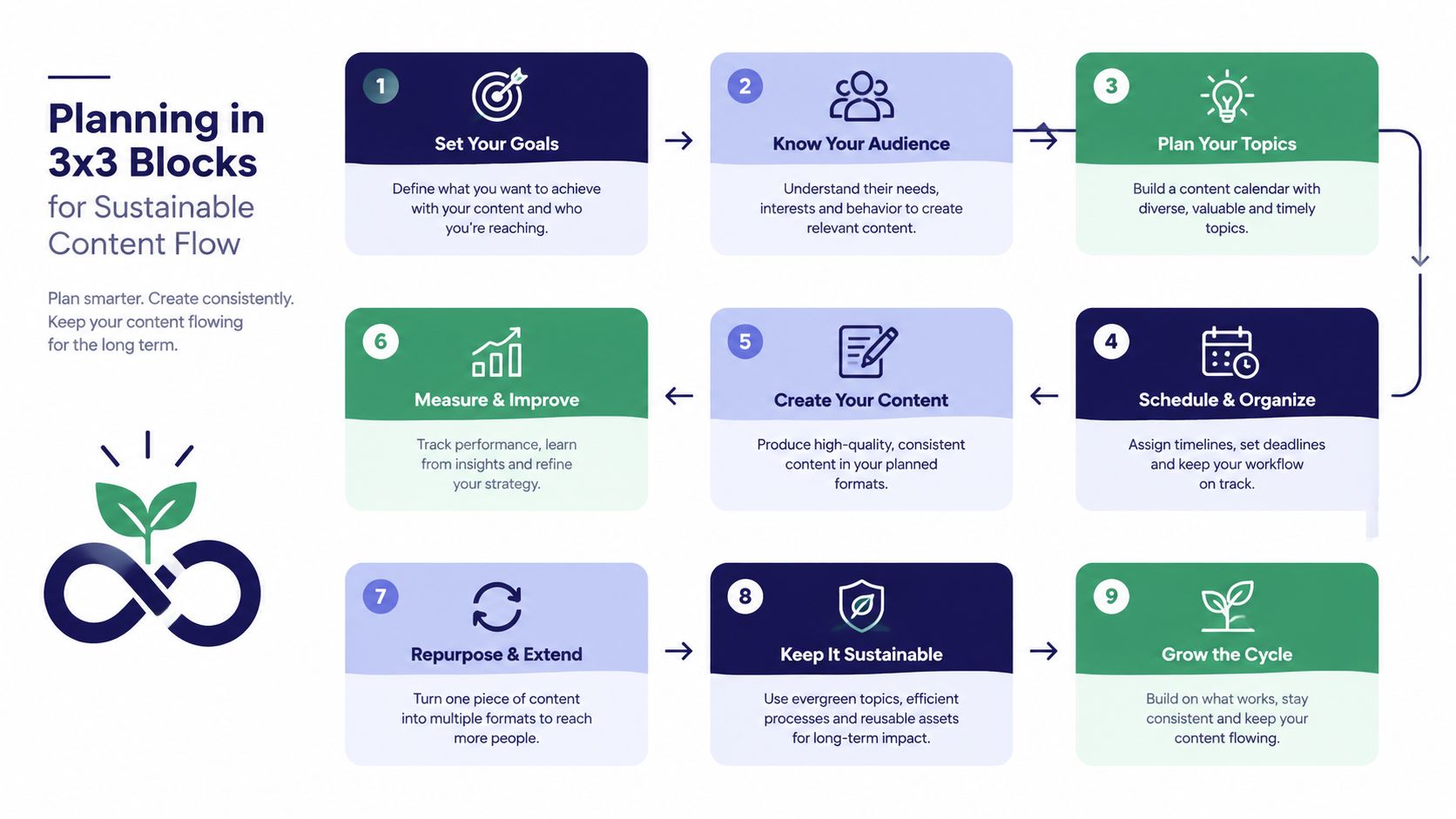
Planning in 3x3 Blocks for Sustainable Content Flow
Post-by-post planning creates unnecessary pressure. A volunteer sees an empty space, finds whatever asset is available, and publishes it. The result may be timely, but the profile develops no visual rhythm and the team has no dependable process.
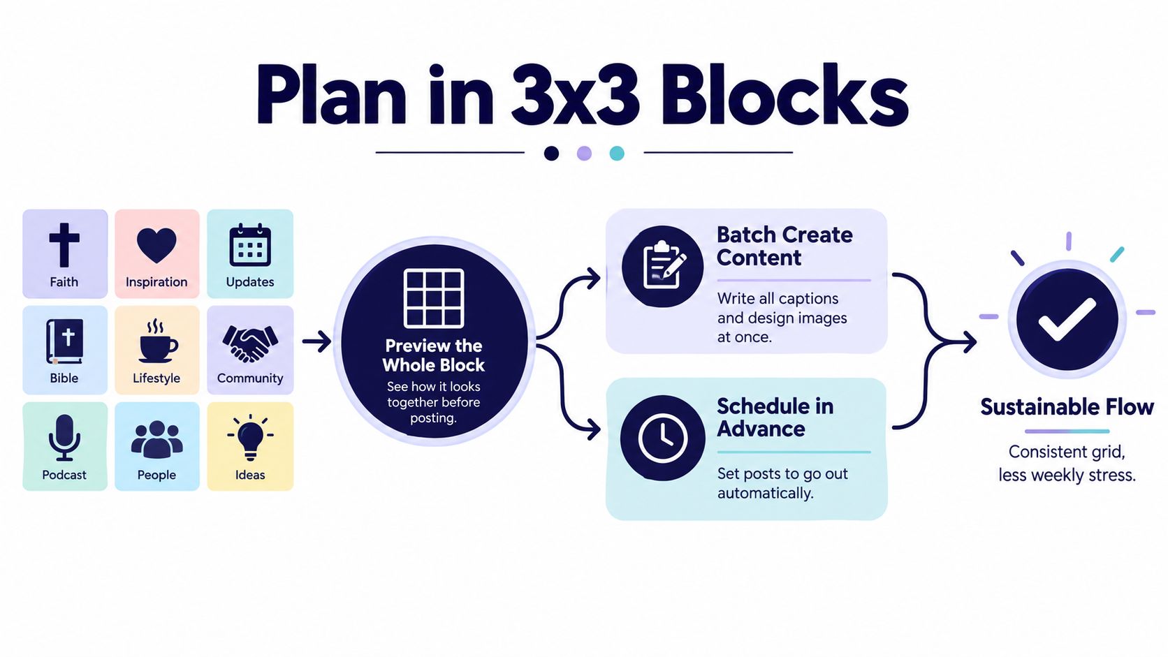
Plan in 3×3 blocks, or groups of nine posts. One independent workflow recommendation advises working in multiples of nine, previewing the complete unit, and keeping the next 2 to 5 posts flexible so the order can change as new content arrives. The 3×3 planning method works because it provides structure without locking the church into a long sequence.
Create a block that can survive church life
Suppose your next block supports a sermon series. You might include a series cover, a sermon Reel, a practical takeaway carousel, a scripture image, a small-group prompt, a Sunday reminder, a community photo, an upcoming event, and a final invitation. Each post should provide value independently, while the full block should feel balanced in color, format, and emphasis.
Use a simple review sequence:
- Collect the content. Gather sermon notes, approved photos, event details, and design needs.
- Assign each asset to a pillar. This exposes gaps before publishing.
- Preview the nine-post block. Look for repeated colors, overly similar covers, and missing calls to action.
- Keep the next 2 to 5 posts movable. A last-minute baptism announcement or pastoral update may need to take priority.
- Schedule only after the order works. Flexibility is part of the system, not a failure of planning.
For puzzle-style layouts, prepare a source image of at least 3240 × 3240 pixels so each of the nine exported tiles can be 1080 × 1080. This image-size guidance supports square tile quality when the pieces are assembled on the profile.
A puzzle grid also requires reverse publishing. Instagram places the newest post in the top-left position of the assembled grid, so the final tile must be posted first and the first tile last. This method works for a planned campaign, but it becomes fragile when pastoral needs change. If your team can't protect the publishing order, use coordinated covers and content pillars instead.
Protect the profile preview
Instagram profile thumbnails are described as using a 3:4 portrait shape, and a vertical band can disappear between columns in the profile view. Grid-size guidance makes the practical point clear: keep faces, logos, headlines, and other essential elements away from the side edges.
Church teams don't need to design every post as a puzzle. They do need to preview how an event title or sermon cover will look after cropping. A drag-and-drop planner can catch problems before a volunteer publishes them, which is far easier than explaining a confusing graphic after it has already gone live.
If your church needs ongoing design support beyond internal capacity, a service offering unlimited design plans for brands may be worth comparing with your current volunteer workflow. The right choice is the one your team can sustain, approve, and use consistently.
When Perfect Grids Hurt Church Growth
A beautiful grid can still be a poor ministry tool. Churches often lose momentum when volunteers delay a timely invitation because it would interrupt a color pattern, or when they turn a clear event announcement into a vague graphic because the design needs to match a puzzle.
Aesthetic-first planning prioritizes visual harmony. It may use a strict checkerboard, columns, or a multi-post image. This approach can help a new visitor recognize the church quickly, especially when the profile contains many unrelated contributors. It also demands discipline. One urgent announcement, an unexpected schedule change, or a strong sermon clip can break the pattern.
Outcome-first planning prioritizes clarity, relevance, and a manageable production rhythm. The team uses consistent templates and recurring pillars, but it allows a powerful Reel, a timely weather notice, or a registration deadline to appear when people need it. The profile still feels intentional because the visual rules are stable even when the exact sequence changes.
| Choose aesthetic-first when | Choose outcome-first when |
|---|---|
| A campaign has a fixed visual story | Ministry news changes quickly |
| One person controls design and publishing | Volunteers share responsibility |
| The profile needs a short-term reset | The church needs regular communication |
| Every tile can be approved in order | Speed and clarity matter more than symmetry |
Instagram now contains a dynamic mix of Reels covers, carousels, and static posts, not just a photo mosaic. Guides often emphasize color palettes, preview tools, and batches of nine to twelve posts, but they less often address the cost of delaying useful content. The profile should support the feed, not trap it.
A church's best grid is one that helps people take the next faithful step, even when the newest post doesn't match every neighboring tile.
Use a simple rule: if a design decision makes the message harder to read, requires excessive volunteer coordination, or delays a time-sensitive invitation, relax the aesthetic. Keep your colors, typography, and cover logic. Release the rigid pattern.
Building Your Workflow with ChurchSocial.ai
The most sustainable church workflow starts with material you already have. A sermon transcript can become a short social post, a discussion prompt, a blog article, and a Reel without asking a volunteer to begin with a blank screen.
Turn one sermon into a content batch
After worship, review the transcript and identify several distinct ideas. One can become a concise reflection, another can become a carousel explaining the central point, and another can become a short sermon clip. Check every AI-generated draft for theological accuracy, pastoral tone, and context before publishing. AI can reduce repetitive production work, but a ministry leader still owns the final message.
ChurchSocial.ai supports AI-generated Reels from sermons and can create content from a sermon transcript, including social posts and blogs. Its graphic templates and editor help volunteers prepare branded photos and carousels without requiring advanced design experience.
Use a consistent production order:
- Source: Start with the sermon transcript, event information, or ministry calendar.
- Adapt: Create captions, clips, carousels, and supporting written content.
- Review: Confirm names, dates, scripture references, tone, and calls to action.
- Arrange: Place the assets in a 3×3 block or a flexible pillar sequence.
- Schedule: Set the publishing dates and leave room for urgent updates.
Put the calendar in charge of the rhythm
A drag-and-drop calendar gives a volunteer a profile-level view instead of a list of disconnected tasks. They can move an event carousel, sermon clip, or scripture graphic when a service date changes, then review the surrounding sequence before publishing.

The platform can manage and update church social media across a unified calendar, including Instagram, Facebook, TikTok, and YouTube. It also integrates with Planning Center and other church calendars to create content for events, which reduces the chance that a registration deadline or ministry gathering stays trapped in an internal schedule.
Churches that want a more focused comparison of planning tools can review this guide to a social media scheduler for Instagram. The key is not to automate every decision. It's to give a small team a dependable place to create, review, arrange, and publish.
Measuring What Actually Matters for Your Church Grid
Follower count alone can't tell you whether your profile helps people connect with your church. A healthier review asks what visitors do after encountering the content. Do they visit the profile, open the website, check service information, register for an event, send a message, or share a post with someone who needs it?
Start with a monthly review that a volunteer can complete without becoming a data analyst. Look at profile visits, website taps, direct messages, event responses, shares, saves, comments, and the content formats that produced those actions. Compare similar posts with similar purposes, such as two event carousels or two sermon clips, rather than treating every post as an equal experiment.
Review the grid and the message together
Visual consistency should help people understand the content. If a post receives attention but produces confusion, revise the headline, caption, or call to action. If a clear event graphic gets little response, examine whether the date, location, and next step are visible before changing the entire visual identity.
Track qualitative feedback too. Volunteers and ministry leaders may notice that people mention a sermon clip in conversation, ask about a group after seeing a carousel, or share a prayer post with a friend. Those observations won't replace platform analytics, but they can reveal ministry value that a dashboard misses.
Test one meaningful change at a time:
- Cover clarity: Compare a direct sermon title with a more abstract design.
- Format: Compare a short Reel with a carousel covering the same idea.
- Call to action: Ask people to register, save, share, or send a message, then observe the response.
- Visual treatment: Compare a photo-led post with a simple illustrated or object-based design.
Don't change pillars because one post underperforms. Look for patterns across several posts, then adjust the mix. A church grid should remain spiritually authentic and locally grounded, while analytics helps you decide which clear messages deserve more room.
ChurchSocial.ai helps churches turn sermons into AI-generated Reels and social content, create photos and carousels with graphic templates and an editor, and manage publishing through a simple drag-and-drop calendar. Visit ChurchSocial.ai to build a flexible Instagram grid workflow your volunteers can maintain without sacrificing timely ministry communication.