A volunteer drops a bright neon Canva graphic into the church group chat on Wednesday. On Sunday, the announcement slide comes from an old PowerPoint file, and the youth pastor shares a sermon clip with a random stock image. Everyone worked hard, but the church's social feed now looks like several unrelated organizations are speaking.
That problem doesn't mean your team lacks creativity. It means your church needs nonprofit branding guidelines that volunteers can understand and use without calling a designer every time they make a post. A workable guide gives your team a recognizable logo system, a locked color palette, clear voice rules, reusable templates, and one person responsible for final approval.
Church branding isn't a corporate luxury. It's a practical way to help newcomers recognize your congregation, understand what you stand for, and feel confident that the same church is speaking across Sunday slides, Instagram, email, events, and printed materials. The right guide can also cover related visual choices, from ministry apparel to resources that help you find the right choir uniform without creating another disconnected look.
If volunteers keep asking which logo to use, staff members choose different colors for the same ministry, posts need repeated redesigns, event details change after publication, or newcomers can't tell whether two accounts belong to the same church, you're ready to document the rules.
When Sunday Posts Look Like Five Different Churches
Inconsistent branding rarely causes a dramatic crisis. It creates small moments of hesitation. A visitor sees one logo on the website, a different mark on Facebook, and an unfamiliar color scheme on an event graphic. A longtime member may ignore an announcement because it looks like an unofficial post. Your volunteers then spend their limited time repairing assets instead of serving the congregation.
Academic nonprofit branding work has long treated consistency as a requirement for brand equity, not merely a design preference. The framework recommends stronger internal coordination, more concentrated external communication, and organizational standards that build integrity over time. It also describes a strong nonprofit brand as simple, clear, consistent, unique, inspirational, portable, and relevant, with audits that examine internal, external, and overall consistency separately. (Read the nonprofit branding framework)
Practical rule: If a volunteer needs to guess, your brand document is incomplete.
Build a rulebook people will actually use
Start with five decisions:
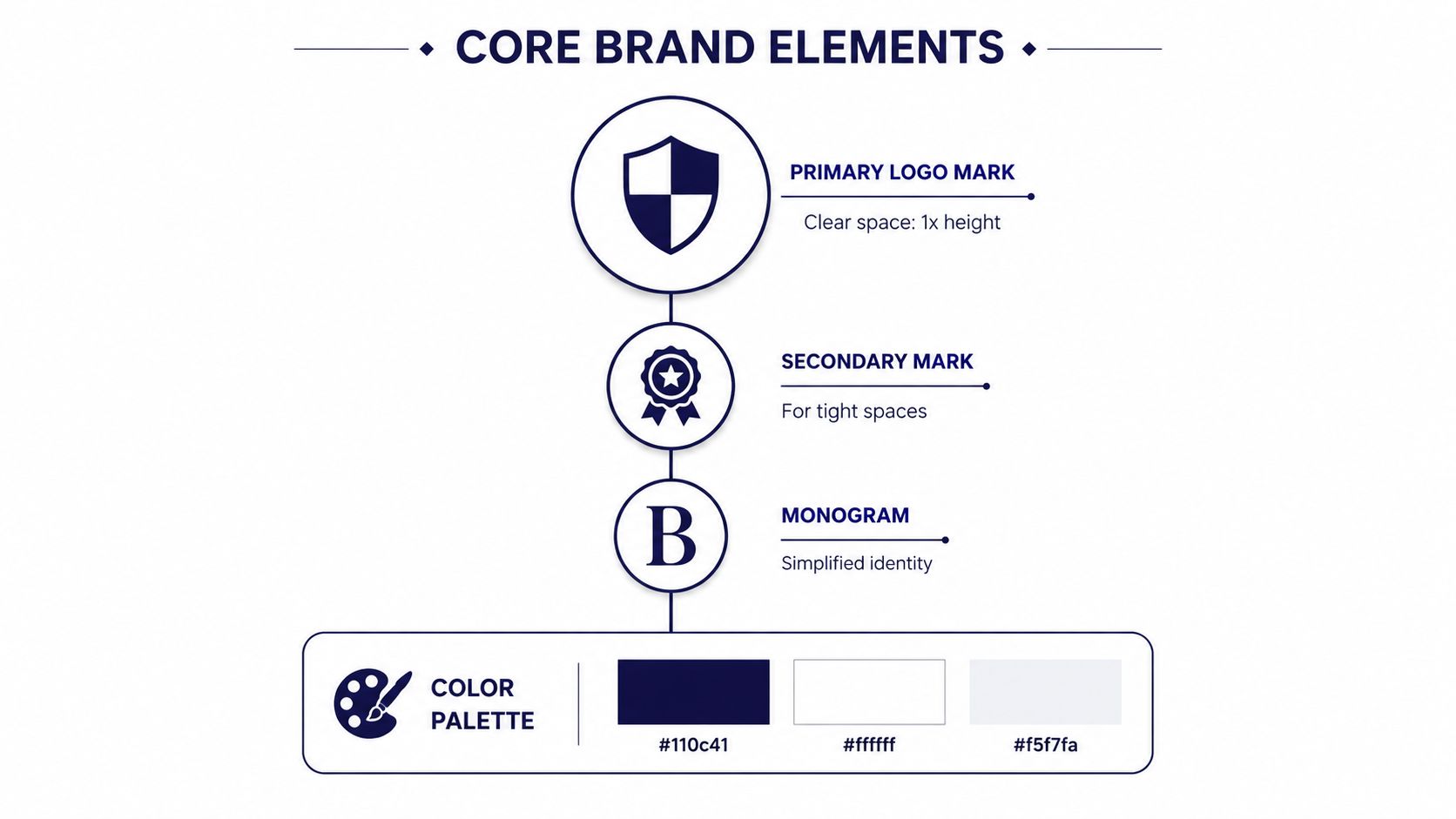
- Logo system: Define the primary mark, secondary mark, monogram, approved backgrounds, and clear-space rules.
- Color palette: List the exact digital and print values, not just color names such as “blue” or “warm gray.”
- Voice rules: Show how the church sounds in captions, invitations, testimony posts, and urgent announcements.
- Template library: Provide approved layouts for the posts your team creates most often.
- Single approval owner: Name one brand steward who can approve posts and settle disagreements quickly.
Keep the first version short enough for a volunteer to read before creating a post. A living brand document should include the church's story, mission, colors, fonts, logo variants, and usage contingencies, supported by a brand kit that makes the approved choices easy to access. 501 Commons' nonprofit brand guide elements also emphasizes full legal name rules, mission, values, tagline, channel templates, and practical mockups.
You're not behind because your church has accumulated mismatched graphics. You've reached the point where memory and personal preference no longer scale. The guide gives every volunteer the same starting point, while a platform such as ChurchSocial.ai can turn those decisions into repeatable social workflows.
Why Mission Clarity Beats Visual Polish
Church teams usually drift toward one of two communication styles. Mission-first messaging leads with the church's purpose, Scripture, testimony, community, and lived impact. Utility-first messaging leads with the time, location, registration link, childcare detail, or call to action.
Both have a place. Utility-first posts help people act quickly. Mission-first communication helps people understand why the invitation matters and whether the church's values fit their expectations.
| Dimension | Mission-First Voice | Utility-First Voice |
|---|---|---|
| Primary job | Builds recognition, meaning, and credibility over time | Delivers logistics and prompts immediate action |
| Typical content | Testimony, Scripture, ministry story, community impact | Date, time, location, registration, reminder |
| Main strength | Gives the church a distinct voice | Makes next steps easy to find |
| Main risk | Can bury essential details if poorly structured | Can make every church sound interchangeable |
| Best use | Most ongoing content and campaign framing | Event details, deadlines, changes, and reminders |
The academic tradition around nonprofit branding treats the brand as more than an identifier. It connects consistency with trust and emotional connection, and later nonprofit brand equity models identify consistency, focus, trust, and partnership as core dimensions. (Historical nonprofit brand equity research) Recent research in Frontiers in Communication also reports that donors who perceive a match between their ideal charity brand and the charity's actual brand report more financial contributions. (Frontiers in Communication research on nonprofit brand alignment)
Make mission-first the default
In 2026, I'd make mission-first the default for church social content. That doesn't mean turning every event reminder into a sermon. It means the event graphic carries the practical information, while the caption or surrounding content explains the church's purpose and the people the event serves.
A documented rule resolves the tension:
- Use utility treatment for dates, times, registration, transportation, childcare, and urgent changes.
- Add mission framing to ministry invitations, sermon clips, giving appeals, volunteer recruitment, and community stories.
- Reject generic stock imagery and AI-generated filler when they don't reflect your congregation or ministry.
- Use a real sermon insight, local phrase, Scripture connection, or testimony detail to make the post sound like your church.
For a fuller process for clarifying that foundation, use this guide on how to write a church mission statement. A clean graphic gets attention. A clear mission gives people a reason to trust what they're seeing.
Core Elements Every Church Brand Document Needs
A brand document should answer the questions volunteers ask while they're making a post, not showcase design terminology. Put the mission near the beginning, then make the visual and writing rules concrete enough that someone working from a phone can follow them.
Logo and color
Give volunteers a primary logo mark, a secondary mark for tight spaces, and a monogram for profile images or small placements. Measure clear space using the logo's cap height, and show the minimum size for web and print in the actual files. Your do-not list should be blunt: don't stretch the logo, recolor it outside approved versions, rotate it, or add a drop shadow on dark backgrounds.
Record the palette in the formats people need:
- Primary color: HEX, RGB, and CMYK values.
- Supporting color: HEX, RGB, and CMYK values.
- Third color: HEX, RGB, and CMYK values.
- Neutral: HEX, RGB, and CMYK values for backgrounds and body copy.
- Accent: HEX, RGB, and CMYK values for calls to action.
Don't publish invented values. Pull them directly from the approved files and label each use clearly.
Typography and voice
Choose one web-safe font and one Google Font pairing. Assign exact weights for headlines and body copy, then establish a minimum 16 pixel screen-text rule, consistent with social accessibility guidance that recommends readable text and avoiding excessive copy inside images. (European Union social-media accessibility guidance)
Define the voice with three adjectives, two example sentences, and three phrases to avoid. For example:
- Voice: warm, grounded, invitational.
- Example: “You don't have to walk through this season alone.”
- Example: “Join us Sunday as we make room for questions, prayer, and hope.”
- Avoid: “You guys,” “Don't miss this epic event,” and “We're changing the world.”
Imagery and accessibility
For church social posts, use images that feel local, calm, and purposeful. Whenever possible, choose images without people. If an image includes text, place it where text would naturally exist, such as on paper, a whiteboard, or a sign. Text can also be added as a deliberate overlay after the image is created, but don't scatter words across random objects in the scene.
Every image needs meaningful alt text, especially when the graphic contains information. The University of Nebraska guidance recommends describing image text fully in alt text, using meaningful alternative text for every image, and maintaining strong color contrast. (Social media accessibility best practices from the University of Nebraska)
If your church needs professional help producing approved visual assets, treat Brand Content Production as a separate production resource, not a substitute for the church's own brand decisions.
Usage Rules That Keep Volunteers on Brand
A good brand document doesn't ask volunteers to develop taste. It gives them yes-or-no decisions.
Turn design preferences into checks
Write rules in the same language your team uses during production:
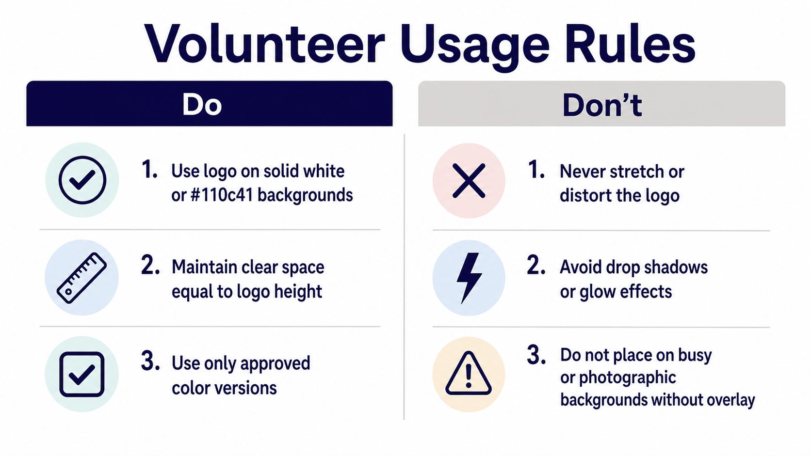
- Use the logo: Place it on solid white or #110c41 backgrounds when those are approved by your church.
- Protect clear space: Keep space equal to the logo's height around every side of the mark.
- Use approved versions: Select only the logo files stored in the shared brand folder.
- Keep contrast accessible: Use a minimum contrast ratio of 4.5:1 for readable text.
- Set readable type: Use at least 16px for body text on screens.
- Describe every image: Add alt text of 125 to 150 characters for each published image, while making sure the description communicates the image's meaning.
- Respect the mark: Never stretch, rotate, recolor, glow, or place the logo over a busy photograph without an approved overlay.
- Limit decoration: Set platform-specific limits for capitalized words, slang, and emoji so the church doesn't sound frantic or inconsistent.
The exact logo examples should appear beside these rules. The volunteer should be able to compare a draft against the guide in seconds.
Show the rewrite, not just the rule
A before-and-after example teaches faster than a page of warnings.
Before: “OMG!!! Don't miss our AMAZING youth night this Friday!!! Bring everyone 🔥🔥🔥”
After: “Youth Night meets Friday for worship, conversation, and time together. Invite a friend, and check the event details for the start time and location.”
The revised caption removes unnecessary shouting, explains the purpose, and leaves room for the practical details. Your guide can include platform notes, such as restrained emoji use on Instagram, no all-caps event titles, and plain-language captions for Facebook.
The same discipline applies outside social media. If your church prints shirts, signs, or volunteer materials, keep production within the same system and consider budget-friendly merch for nonprofits when you need physical items that still follow approved colors and logo rules.
Volunteers who manage these details need clear role boundaries. This guide on the volunteer social media manager can help define who creates, reviews, schedules, and responds.
Templates and Tools That Make the Brand Stick
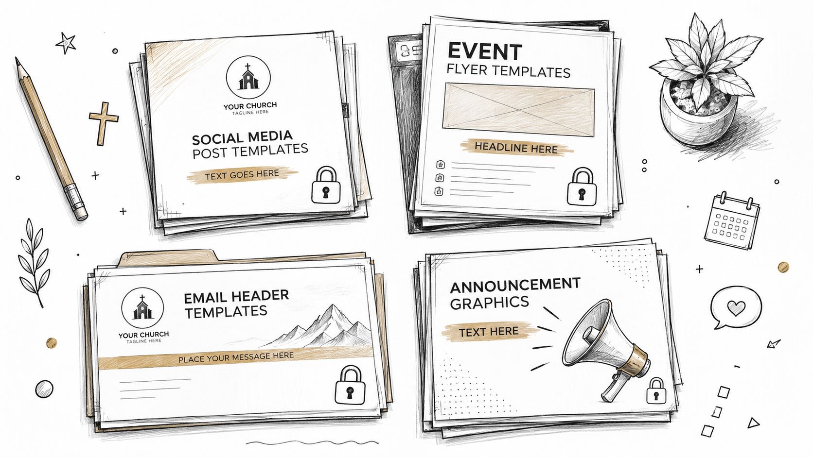
A PDF can explain the brand. Templates enforce it. If volunteers open a blank canvas for every announcement, they'll eventually improvise the logo position, fonts, spacing, and color treatment.
Create four template families first:
- Sermon clip posts: A consistent frame for video, sermon title, speaker name, and short takeaway.
- Event flyers: A clear hierarchy for event name, date, location, registration, and ministry identifier.
- Email headers: A restrained header that carries the logo without competing with the message.
- Announcement graphics: Repeatable layouts for Sunday reminders, giving updates, prayer prompts, and ministry news.
Lock the elements that shouldn't change. Set the logo position, color tokens, font fallbacks, margins, and export dimensions. Let volunteers edit the event name, date, photo, and copy, but don't let them move the identity system unless the brand steward approves an exception.
Connect sermons, templates, and scheduling
A useful church workflow starts with material you already have. Upload a sermon video or outline, generate caption drafts and suggested hashtags, then match the message with a graphic sized for the intended platform. A volunteer still reviews the result, removes filler, checks theology and names, and makes sure the image follows the church's preference for minimal text and purposeful imagery.
ChurchSocial.ai supports AI-generated sermon reels, sermon-transcript content such as social posts and blogs, graphic templates and an editor for photos and carousels, and a drag-and-drop calendar for planning and updating social accounts. Its workflow also supports approval before publication, which keeps automation from becoming an excuse to skip pastoral review.
Use the platform's calendar to route drafts to a coordinator before publishing. For event-driven churches, connect the calendar source that carries the authoritative date. Planning Center Calendar supports recurring weekly events, room reservations, service times, and a central church calendar. (Planning Center's centralized event workflow) Planning Center can also publish events to Church Center, embed them on a website, or generate an iCal feed for subscribers. (Planning Center Calendar tools)
Document other integrations your church relies on, such as Google Calendar for events, YouTube for sermon clips, and Canva imports for legacy templates. The principle is simple: keep the approved brand choices close to the place where volunteers create and publish.
For a practical guide to building these repeatable assets, use how to create templates.
Rolling Out the Guidelines Without Overwhelming Volunteers
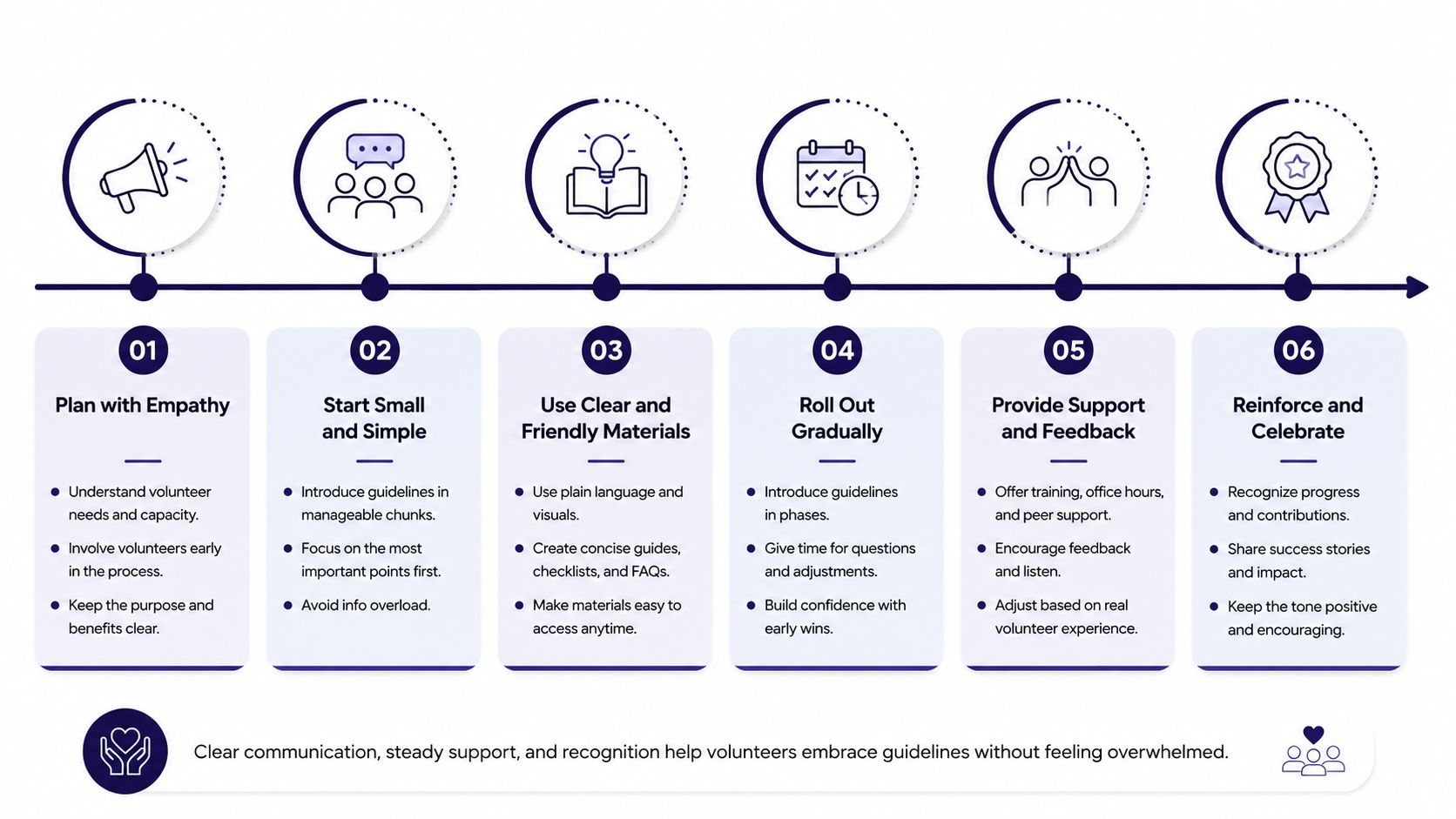
Don't launch a large brand book and hope people read it. Roll out the rules in stages, then move the daily decisions into templates and approval workflows.
Use a three-phase launch
Phase one, week one: Publish a one-page cheat sheet covering the logo, colors, and voice. Pin it in every team channel, add it to onboarding documents, and store the approved logos and fonts beside it.
Phase two, weeks two through three: Run a 30-minute live training using two real posts. Show one post that needs correction and one that meets the standard. Record the session for volunteers who serve outside normal office hours.
Phase three, week four onward: Require template-based posts for routine content. Route exceptions to one approver instead of asking every volunteer to interpret the rules independently.
A brand steward protects the system. They don't become the bottleneck.
Assign ownership before launch
Name a brand steward, whether that's the communications director, volunteer social lead, or another trusted person. Give that person quarterly review duties, including checking templates, updating examples, and confirming that the guide still reflects the church's mission.
Choose a backup approver for illness, holidays, and unexpected absences. Write an escalation path for one-time exceptions, such as a guest speaker's supplied artwork or an emergency community announcement. The path should state who can approve the exception, where it gets recorded, and whether the asset becomes an approved template later.
Keep feedback specific. Don't tell a volunteer that a post “doesn't feel on brand.” Say that the logo is too close to the edge, the headline uses an unapproved weight, or the caption buries the invitation. Clear corrections teach the system without embarrassing the person.
Maintaining the Brand Long After Launch Day
Six months after launch, a healthy church workflow looks ordinary. The volunteer opens an approved sermon template, adds a clip, checks the caption against the voice examples, confirms the event details, and sends the draft to the brand steward. The Sunday announcement, youth post, and ministry email don't look identical, but they clearly belong to the same church.
That consistency requires recurring habits.
- January audit: Compare the current social grid against the brand board. Look for logo drift, new colors, inconsistent typography, and imagery that no longer fits the church's stated approach.
- Quarterly voice review: Export post analytics and review the tone, not just the reach. Look for repeated phrases, excessive urgency, unclear invitations, and captions that sound unlike the church.
- Post-event check: Review channels after Easter, VBS, and Christmas, when well-meaning volunteers often flood social accounts with unsorted graphics, duplicate announcements, and last-minute changes.
- Volunteer onboarding: Give every new volunteer a 15-minute walkthrough and the one-page cheat sheet before assigning publishing access.
- Single source of truth: Keep revisions on one shared guideline page. Don't bury the current rules across old PDFs, personal drives, and team chats.
The owner can be a communications director, volunteer lead, or rotating committee, but the responsibility must be visible. Quarterly reviews should produce small corrections, not constant rebrands. Your church needs continuity more than novelty.
Make one decision this week. Pick a date six months from now and block it on the church calendar as the first brand-health review. A scheduled review turns maintenance into ministry infrastructure instead of another problem your team discovers during the busiest week of the year.
ChurchSocial.ai gives church teams a way to turn nonprofit branding guidelines into daily practice, with sermon-to-reel creation, transcript-based posts and blogs, branded templates, a graphics editor, and a drag-and-drop social calendar that can connect with church event calendars. Visit ChurchSocial.ai to organize your templates, approvals, sermon content, and social publishing in one place.