A volunteer trims a strong sermon clip on Saturday night. They add “Join us Sunday at 10 AM,” drop in the church logo, export the Reel, and feel done.
Then they open Instagram on their phone and see the problem right away. The caption covers the service time. The buttons crowd the lower right corner. The logo sits too close to the edge and feels half-lost. The message is still there, but the important part is harder to catch.
This is why the reels safe area matters for churches. It is not a design trend. It is the difference between a clear invitation and a post that makes people work to understand what they are seeing.
Reaching Your Community Without Cutoffs
Church teams usually do not struggle because they lack heart. They struggle because social platforms add small obstacles that are easy to miss until a post is already live.
A sermon clip can look excellent inside Adobe Premiere, CapCut, or Canva and still fail on Instagram once the app layers on usernames, captions, and action buttons. Volunteers often assume that if a video fills the screen, everything inside it is fair game. It is not.

What the safe area means
The reels safe area is the part of the video frame where your key content stays visible after Instagram adds its interface.
For a church, that usually includes:
- The spoken moment that matters: A pastor’s face, a baptism highlight, or a testimony clip.
- The invitation: Service times, event details, or a next-step prompt.
- Your identifying details: A logo, series title, or campus name.
- Readable text: Scripture, subtitles, or a short sermon takeaway.
When those elements drift too high, too low, or too close to the sides, Instagram can make your post feel cluttered even if your editing was solid.
Why church teams feel this pain fast
Church communication usually depends on a few simple messages repeated clearly. Sunday service times. Midweek events. A Christmas concert. VBS registration. Easter invitations. A short encouragement from the sermon.
If the core detail gets blocked, the post still exists, but it loses force.
Tip: If someone can only watch your Reel once with the sound off, the screen still needs to communicate the main message quickly and cleanly.
A lot of church social media work happens under time pressure. One volunteer edits after work. A staff member posts between meetings. A pastor reviews content from a phone in the church lobby. In that kind of workflow, guessing at margins usually leads to rework.
A simple safe-area habit removes that guesswork. It helps volunteers place faces, captions, Bible verses, and event details where Instagram is least likely to interfere. That protects the message and lowers stress for the people serving behind the scenes.
Protecting Your Ministry's Key Information
When a church posts a Reel, it is usually trying to do one of three things. Invite someone, encourage someone, or help someone take a next step.
That is why poor placement hurts more than people think. If a punchy sermon line gets hidden, viewers may still understand the clip. If the service time, event date, or registration instruction gets covered, the post misses the practical outcome your team needed.
The parts of the screen that work against you
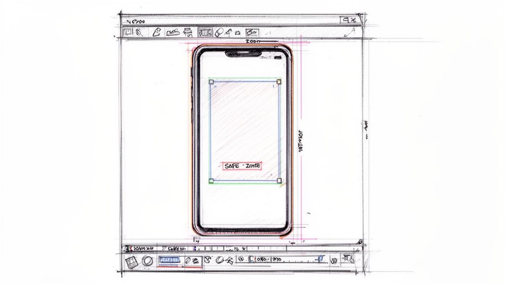
Instagram Reels use a 9:16 aspect ratio at 1080 x 1920 pixels, and the recommended central safe zone is 1010 x 1440 pixels. That leaves the top 220 pixels and bottom 320 pixels as risky areas because Instagram places interface elements there. This matters on a platform with over 2 billion monthly active users, where Reels drive 50%+ of time spent on Instagram (Strike Social on Reels safe zone specs).
For church communicators, those top and bottom areas are where mistakes usually happen.
At the top, a title card can crowd the space where account details appear. At the bottom, an event invitation can compete with captions and buttons. A lower-third name tag can look fine in the editor and then feel jammed once the post is live.
What gets lost first
The content most likely to suffer is often the content your church most needs people to notice.
Consider how that plays out:
- A sermon clip loses context: If the speaker’s face sits too low, subtitles and controls pull attention away from the message.
- An event Reel loses clarity: “Wednesday at 6:30 PM” tucked near the bottom can become hard to read.
- An invitation loses urgency: “Plan your visit” or “Join us this Sunday” does not help if people cannot see it clearly.
- A branded post loses consistency: A logo pushed into a corner may not disappear fully, but it starts to look accidental.
That trade-off matters because church posts are rarely just for engagement. They are part of hospitality. They help someone decide whether to visit, watch, register, or ask for prayer.
Stewardship in a crowded feed
Churches do not need polished social media for vanity. They need clarity.
When Reels take up that much attention on Instagram, it makes sense to treat layout as part of ministry execution. Not because every post must look like an ad campaign, but because avoidable cutoffs weaken the message.
Key takeaway: The safest Reel is not the one with the most text. It is the one where the most important text is impossible to miss.
A lot of teams try to solve this by shrinking everything. That rarely works. Tiny text is still bad text, even if it technically fits. The better move is to simplify the message, choose one visual focal point, and keep critical information away from the danger zones.
That approach serves both the viewer and the volunteer. People understand the post faster. Your team spends less time fixing preventable mistakes after publishing.
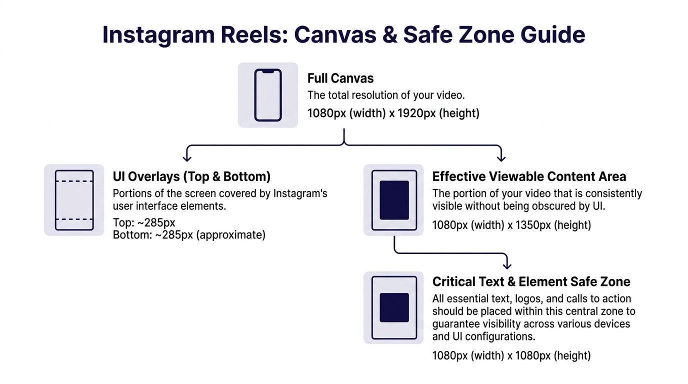
Understanding the Reels Canvas and Safe Zone Specs
The easiest way to think about a Reel is this. The full screen is available, but not all of it is equally safe.
Your video canvas should be 1080 x 1920 pixels in a 9:16 format. Inside that full frame, the central safe zone for key visuals is 1010 x 1440 pixels. For text and graphics, a tighter 810 x 1080 pixels area is the safer choice when you want to avoid interface overlap across devices.
A practical way to read these numbers
Do not think like a designer reading specs. Think like a ministry team building a repeatable workflow.
- Full canvas: This is your total working space.
- Visual safe zone: Keep faces, logos, and primary visuals centered here.
- Text safe zone: Keep verses, dates, and calls to action even tighter.
- Unsafe areas: Top and bottom zones where Instagram places interface elements.
If you are already planning cross-platform video, the same discipline helps on other short-form channels too. This guide on the TikTok video safe zone is useful when your church repurposes one sermon clip for multiple platforms.
Instagram Reels safe area reference
| Element | Dimensions (Width x Height) | Position Notes |
|---|---|---|
| Full canvas | 1080 x 1920 | Standard 9:16 Reel size |
| Main visual safe zone | 1010 x 1440 | Center important faces and visuals here |
| Text and graphic safe zone | 810 x 1080 | Best area for verses, headlines, and CTAs |
| Top unsafe area | Top 220 pixels excluded | Often covered by Instagram UI |
| Bottom unsafe area | Bottom 320 pixels excluded | Often covered by captions and controls |
| Thumbnail crop | 1080 x 1350 | Plan covers so the hook still reads clearly |
What this looks like in church content
A sermon clip usually has one person on screen and one line of text. That is manageable if you center the speaker and place captions in the middle band, not near the bottom edge.
An event Reel is trickier. It often includes date, time, location, and a response prompt. That is where teams get into trouble. The more details you cram into the lower third, the more likely Instagram will fight you.
A better setup is simple:
- Put the hook near the middle.
- Keep the speaker or subject centered.
- Place the event detail above the bottom danger zone.
- Save extra information for the caption rather than forcing it all on screen.
Tip: If a text overlay feels “just barely safe,” move it up. On mobile, barely safe often becomes cut off.
These specs are not there to limit creativity. They give your volunteers a frame to work inside so they can edit faster and publish with confidence.
Creating Reels That Keep Your Message in View
Knowing the safe area numbers helps. Building them into your weekly workflow helps more.
The cleanest manual process is not complicated. It just needs to be consistent. If your church uses Adobe Premiere, Final Cut Pro, CapCut, or Canva, the same basic pattern works.
A simple editing workflow that volunteers can repeat
For Instagram and Facebook Reels at 1080 x 1920, a recommended boosted-content safe zone is 1010 x 1280 pixels, with 220 pixels of top clearance and 420 pixels of bottom clearance. Content that stays inside those zones can see 20-30% higher engagement, and one frequent mistake is underestimating the lower margin, which can leave 40% of CTAs obscured on mobile (Ignite Social Media on safe zones for TikTok and Instagram Reels).
That sounds technical, but the workflow is straightforward.
Start with the right canvas
Open a project at 1080 x 1920. Do this first, not after editing. Reframing horizontal footage at the end often creates avoidable problems.Add a safe zone overlay
Import a transparent guide PNG and place it on the top layer of your timeline. Lock it so volunteers do not move it by accident.Center the human focus
If it is a sermon clip, keep the pastor or speaker in the middle area. Faces placed too low compete with subtitles and interface controls.Move text higher than feels necessary
Most church teams place text too low. Service times, event invites, and Bible verses should sit above the lower danger zone.Hide the overlay before export
Keep the guide in your project template, but turn it off for the final render.
What works well for church Reels
A good church Reel does not try to explain everything. It creates one clear next step.
The posts that usually hold up best are:
- Sermon highlights with one takeaway: A short statement on screen, centered and easy to read.
- Event promos with one main action: “Join us Sunday” or “Register this week,” not a paragraph.
- Scripture encouragement clips: One verse reference and one simple visual focus.
- Testimony moments: Clean captions and a speaker framed in the center.
If you need inspiration for structuring clips before you lay them out, this guide on video clips for Reels is a helpful starting point.
What usually fails
A few mistakes show up over and over in church workflows.
- Too much lower-third text: It looks like a TV graphic, but Reels do not give you that much protected space.
- Tiny captions: Teams shrink text to make it fit, then nobody can read it.
- Logos in corners: This feels safe, but corners often become weak spots on mobile screens.
- Multiple calls to action: “Visit, register, share, DM us, join us” is too much for one short clip.
Practical rule: One Reel should carry one main message. Put supporting details in the caption or comments, not all over the frame.
The biggest win is not editing one Reel correctly. It is making sure the next twenty are easier.
A healthy church workflow uses saved templates:
| Content type | On-screen focus | Placement habit |
|---|---|---|
| Sermon clip | Speaker and short caption | Keep both centered |
| Event promo | Title and date | Place above lower UI area |
| Scripture post | Verse excerpt | Use the middle text-safe zone |
| Announcement Reel | One clear CTA | Keep CTA away from the bottom edge |
Once your volunteers learn those patterns, the reels safe area stops feeling technical. It just becomes part of how your church edits.
Streamline Your Content with ChurchSocial.ai
Manual safe-zone editing works. It also takes attention that many church teams do not have.
The challenge gets harder when one sermon clip needs to go to Instagram, TikTok, and YouTube Shorts. All three use vertical video, but they do not protect the same screen space in the same way. A layout that looks fine on Instagram can crop badly elsewhere.

The cross-platform problem church teams run into
Instagram Reels, TikTok, and YouTube Shorts all use 9:16 video, but safe zone margins differ. One example is that YouTube Shorts requires 380px top and bottom clearance, while Instagram Reels uses 220px top and 320px bottom. That means a layout built for one platform can crop important text on another, especially for church communicators posting the same content in multiple places (Verve Creative on cross-platform safe zones).
That is where automation becomes practical, not flashy.
A church social workflow usually includes more than editing. Someone has to pull clips from the sermon, add captions, build event graphics, schedule posts, line them up with the ministry calendar, and make sure they stay consistent with church branding.
Where a platform can remove friction
ChurchSocial.ai fits this workflow by helping churches create sermon clips from transcripts, generate related social content, use built-in design templates, and manage publishing through a visual calendar. That matters when your team is trying to keep text, logos, and calls to action placed consistently without asking every volunteer to memorize platform margins. For churches that want to turn one sermon into multiple assets, repurpose content with AI is the larger workflow behind that process.
The practical benefit is simple. Instead of training every volunteer on pixel spacing, you give them a system.
That system helps with:
- Sermon clips: Pull a strong moment, format it for vertical video, and keep captions readable.
- Event promotion: Use templates that already guide placement instead of starting from a blank file.
- Weekly planning: Build posts around services, ministries, and special events from one calendar view.
- Brand consistency: Keep layouts steady across staff members and volunteers.
Why this matters for small teams
Most churches do not have a full creative department. They have one staff member and two volunteers. Or one pastor and a faithful teenager who knows CapCut. Or a communications director who also handles email, slides, announcements, and the website.
In that environment, reducing decisions matters.
Tip: If your workflow depends on one highly technical person, it is fragile. Safe, repeatable templates make it easier for volunteers to serve well.
The goal is not to remove people from the process. It is to remove avoidable friction. When the system handles more of the layout discipline, your team can spend more attention on the message itself.
Start Creating Clear and Effective Reels Today
Churches do not need to overcomplicate the reels safe area. They need to respect it.
When key information stays centered and clear, your posts become easier to understand. A sermon clip feels more focused. An event invitation feels more useful. A volunteer can publish with fewer surprises.
Keep the goal simple
The point is not to chase perfect design. The point is to make sure people can see what your church is trying to say.
That usually comes down to a few habits:
- Use a vertical 1080 x 1920 canvas
- Keep people and main visuals in the central safe zone
- Move text higher than your first instinct
- Limit each Reel to one main message
- Use templates so volunteers do not start from scratch
Give your team a workflow they can repeat
A healthy church social process should survive busy weeks, staff changes, and volunteer turnover.
That is why the best systems are not built on memory. They are built on clear templates, simple review habits, and tools that reduce manual adjustment. Once that happens, your team spends less time fixing crops and more time sharing encouragement, invitations, and next steps with the community around your church.
Final takeaway: Stop treating cutoff text like a small design issue. For churches, visibility is part of hospitality.
The good news is that this is fixable right away. You can tighten your layout habits today, simplify your on-screen text this week, and create a more reliable content system going forward.
If your church wants a simpler way to turn sermons, events, and weekly ministry moments into scheduled social content, ChurchSocial.ai gives your team one place to create, organize, and publish without relying on a complicated editing workflow.