
After Sunday service, a volunteer opens YouTube and sees a handful of views on last week's sermon clip. The number looks encouraging, but it doesn't answer the ministry question: did people stay, discover the church, or return for more? That's why learning how to check analytics on YouTube matters. The dashboard isn't a scoreboard for the communications team. It's a way to decide which message deserves another clip, which audience needs clearer outreach, and where your limited volunteer hours are being spent.
YouTube Analytics is built directly into YouTube Studio. Google's YouTube Analytics documentation identifies the Audience tab as the place to understand who's watching, while Advanced Mode provides more detailed reporting across channels, assets, and audiences. For a church, the best approach is simple: check a small set of meaningful signals consistently, then use those findings to plan better content.
Opening YouTube Studio Analytics on Desktop
It's Sunday afternoon. The building is quiet, the livestream has finished, and someone on the communications team is wondering whether last week's sermon clip reached anyone beyond the regular congregation. You don't need a complicated reporting system to answer that question. You need the right YouTube Studio path and a date range that gives the numbers context.
Follow the desktop path
- Sign in first: Go to
studio.youtube.comand sign in with the Google account that owns or manages the church's YouTube channel. - Open Studio: Click the profile icon in the top-right corner, then choose YouTube Studio from the dropdown menu.
- Select Analytics: Find the left-hand sidebar and click the bar-chart-shaped Analytics icon. You'll usually land on the Overview tab.
- Set the date range: Use the selector in the top-right corner. Choose Last 28 days for a practical recurring review, or select a custom range when you're measuring a sermon series, event, or outreach campaign.
- Confirm access: Volunteers with channel access roles of Editor or above can see analytics. If a volunteer can publish but can't open the reporting screens, the channel owner needs to review that person's permissions.

Leaving the dashboard on a lifetime view makes recent decisions harder. A Christmas livestream can dominate the historical totals while hiding a recent improvement in sermon clips. Use a consistent period for weekly reviews, then use custom dates for specific ministry efforts.
The screen should populate within minutes with a clean overview ready for interpretation. If your church publishes across several platforms, tools for automated YouTube posts can reduce publishing work, but automation doesn't replace the weekly decision about what your church should create next.
Reading the Overview Tab the Right Way
The Overview tab gives you a quick read on channel health, but the first numbers shouldn't all receive equal attention. Views, watch time, and subscribers each answer a different question. A church team gets into trouble when it treats every increase as equally valuable or every decline as a crisis.
Read the first three cards
Views tells you how often people watched your videos within the selected period. Treat it as an indication of reach, not proof that the video changed someone's behavior. A sermon clip with many views but weak viewing duration may have attracted attention without delivering a clear message.
Watch time in hours shows whether people stayed. YouTube's analytics system connects retention and elapsed video time through comparative reporting, making watch time useful alongside the retention graph rather than as an isolated total. For a church, rising watch time can justify producing more content in a similar format, while falling watch time should prompt a review of openings, pacing, and topic fit.
Subscribers reflects net channel growth, including people who subscribed and those who unsubscribed. A new subscriber is a useful sign of ongoing interest, but it isn't the same as a first-time visitor, a prayer request, or a person who joined a church gathering.
| Metric | What It Measures | What a Church Should Do With It | Red Flag vs Green Light |
|---|---|---|---|
| Views | Video watching activity during the chosen period | Identify which topics earn attention | Green: consistent reach across related videos |
| Watch time | Time viewers spend watching | Improve formats that hold attention | Green: watch time grows with relevant reach |
| Subscribers | Net channel subscription change | Track whether viewers want future content | Red: views rise while subscriptions remain flat |
Use the cards as prompts
The Top videos card on the right shows which videos led the selected period. Click a video to open its individual performance page, where you can inspect deeper retention and engagement information. That drill-down is more useful than ranking videos by views alone because it helps you compare similar clips.
Be cautious with the Realtime card. Its 48-hour view can show a spike, but a sermon may continue reaching people through search, shared links, and recommendations after the immediate window. Screenshot the Overview on Monday morning and compare it with the previous week. For a broader optimization framework, use this YouTube channel optimization guide as a planning reference, but keep your weekly review focused on decisions your team can make.
Understanding the Audience Tab
The Audience tab turns a pile of views into a picture of the people behind them. Open Analytics, then click Audience in the top navigation. Google describes this tab as the place to see who watches your videos, with cards that include monthly audience and subscribers, and Advanced Mode can expose more granular audience reporting through the same YouTube Studio environment.
Separate discovery from loyalty
Start with New viewers and Returning viewers. New viewers show that a topic, title, shared link, or recommendation is introducing people to your church's content. Returning viewers show that people have developed a reason to come back.
A healthy ministry channel needs both. If returning viewers dominate but new viewers remain scarce, your content may serve the existing congregation well without reaching seekers or people exploring faith. If new viewers arrive but don't return, the channel may be making strong first impressions but failing to offer a clear next step.
Turn audience details into decisions
Top geographies should change how you publish. If a meaningful share of your viewers comes from a diaspora community, consider subtitles, examples that travel well across cultures, and posting times that serve viewers outside your local time zone. Don't change the church's voice to chase every location. Make access easier for the people already showing interest.
The When your viewers are on YouTube chart helps you choose a publishing window. Schedule a clip before the audience is most active so the video has an opportunity to collect early interaction. Use the chart as a guide, not a command. A timely prayer update may matter more than an ideal publishing hour.
Age brackets and gender reporting can help you recognize audience composition, but YouTube estimates these categories and not every viewer is represented. An older-skewing audience is not a problem for a church. It may mean your teaching ministry is serving people faithfully. The useful question is what your team should do next: choose a sermon topic, shorten a clip, add captions, or prioritize outreach to an underrepresented group.
Traffic Sources and Click-Through Rate
A video's CTR only makes sense after you know where viewers encountered it. In YouTube Studio, open Analytics, select Content, choose a video, and open Reach. The Traffic Sources card and Impressions click-through rate show how often people watched after seeing the thumbnail, while impressions represent the number of times YouTube displayed that thumbnail. Google explains this relationship in its impressions and CTR guidance.
Read each surface differently
YouTube's default traffic-source categories include Browse, Suggested videos, Channel pages, Playlists, Search, External, and Shorts feed.
- Browse: Home and subscription surfaces test whether your title and thumbnail earn attention from people who may not be actively looking for the topic.
- Suggested videos: Recommendations reveal whether the clip fits alongside related content.
- Channel pages: Visitors already exploring your church's channel are deciding whether the video deserves a click.
- Playlists: A playlist can connect a sermon clip to a series or teaching pathway.
- Search: Seekers have a specific question or phrase in mind, so the title and description need to match that intent.
- External: Email newsletters, your website, Facebook, and shared messages send viewers from outside YouTube.
- Shorts feed: Short-form discovery behaves differently from long-form browsing and should be judged as its own format.
A 5% CTR can mean different things on each surface. Browse CTR evaluates packaging against broad, passive exposure. Search CTR evaluates topic alignment with active intent. External CTR tells you whether the church's own distribution channels are motivating people to open the video.
Use benchmarks carefully
Some independent 2026 benchmark guides cite overall healthy CTR around 3% to 6%, with Search often higher than Browse because search intent is stronger. Treat those ranges as orientation, not a universal grade. Compare a video against its own historical performance after it has accumulated a meaningful impression pool, because early swings from small samples can mislead a volunteer.
| Traffic Source | Low | Healthy | Strong |
|---|---|---|---|
| Browse | Below 2% | 2% to 3% | Above 3% |
| Search | Below 3% | 3% to 8% | Above 8% |
| Suggested videos | Compare with channel history | Compare with related videos | Sustained improvement |
| External | Compare with campaign history | Consistent response | Strong response from owned channels |
The benchmark ranges and surface-specific cautions come from this YouTube Analytics guide. Open the impressions and unique viewers views, filter by traffic source, and log what you see. For a simple test, change only the thumbnail for one week, record the CTR difference, and keep the stronger version. You can also review YouTube auto-generated thumbnails when deciding how to package sermon clips efficiently.
Retention, Watch Time, and the New Views Metric
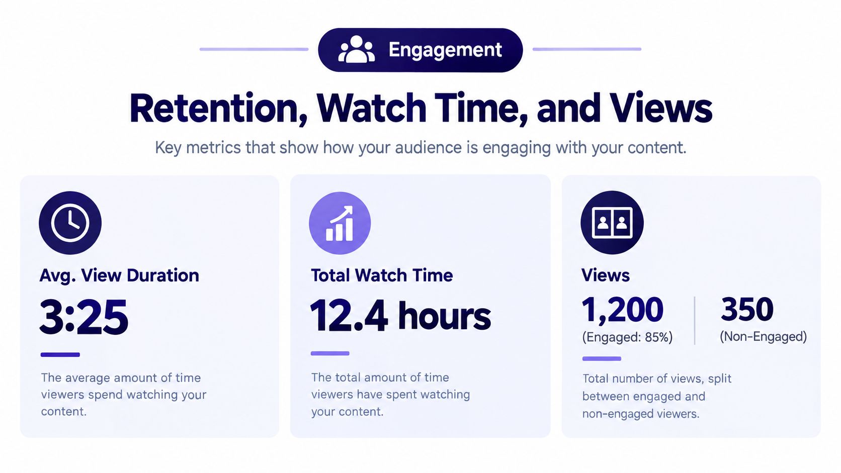
Open an individual video's analytics and select Engagement. The cards that deserve attention are Average view duration, Watch time, and the distinction between public views and engaged views. Don't judge a 60-minute sermon, a short announcement, and a vertical clip by the same retention expectation.
For long-form videos, benchmark sources commonly describe 35% to 50% retention as generally healthy and 50% to 65% or higher as strong. Shorts often need completion signals around 60% to 85% or higher. These benchmarks come from retention analysis guidance, but your first comparison should be between similar videos on your own channel.
Find the moment people leave
Open the audience retention graph and look for the first major drop. For many videos, the opening 30 to 60 seconds carries the greatest risk because viewers decide quickly whether the content matches the promise of the title and thumbnail. YouTube's technical documentation describes normalized retention values, where 0 indicates weaker retention than comparable videos and 1 indicates stronger retention than comparable videos of similar length. That makes the graph a comparison tool, not just a record of abandonment.
Red areas on the graph can show dips where viewers leave, while spikes can indicate moments viewers replay. The absolute viewership curve shows the drop-off cliff. If people leave during a long greeting, trim the greeting in future clips. If they leave when the sermon moves into an unrelated tangent, tighten the edit.
Practical rule: If most viewers disappear during the opening, test the promise and the opening line before blaming the message.
YouTube changed public view counting globally beginning August 24, 2026, so a view can count when a video begins playing from the first frame. The older metric remains available as Engaged views in Analytics under Advanced Mode, according to YouTube's public-view update. YouTube says creator earnings and YPP eligibility remain tied to engaged Shorts views and engaged watch hours, not the newer public-view count.
That distinction matters for churches. A livestream intro or sermon clip may show more public starts without producing deeper engagement. For Shorts, YouTube's 2025 Shorts metric update explains that a view starts when a Short plays or replays, while Engaged views preserve the older signal of viewers who chose to continue watching. If 70% of viewers leave in the first 30 seconds, investigate the packaging and opening before changing the message itself.
Mobile App, Advanced Mode, and Exporting Reports
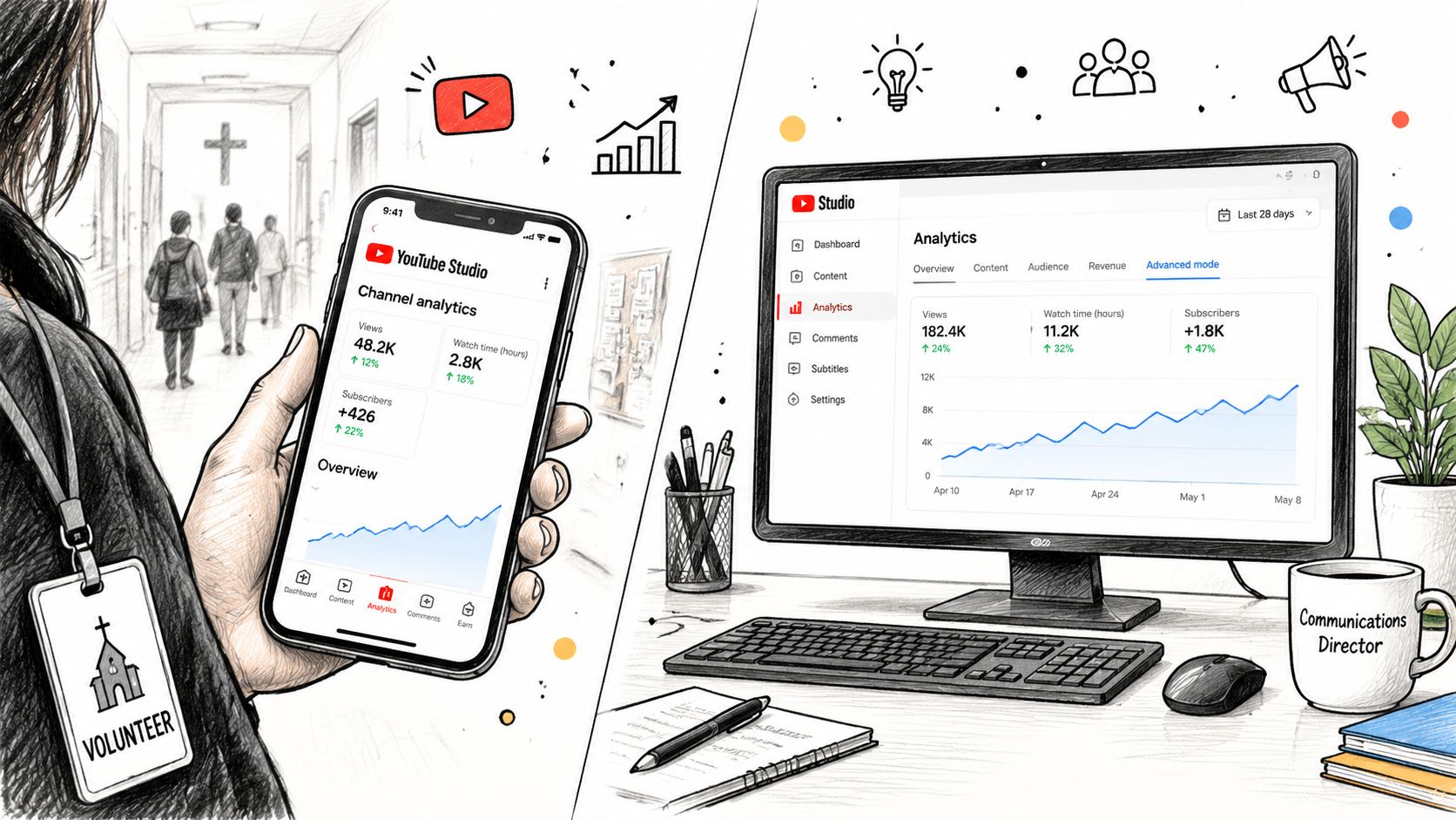
The YouTube Studio mobile app is useful when you're between services, but desktop remains better for careful comparisons. On mobile, tap your profile picture, choose YouTube Studio, and open Channel Analytics or Content. The simplified layout presents Overview, Audience, and Engagement cards, and you can swipe between metric cards without opening every chart.
Use desktop for comparisons
Desktop Advanced Mode is where a communications pastor can answer more specific questions. Change the date range, compare two videos side by side, and stack lifetime data against the Last 28 days view to spot seasonal patterns around Christmas Eve or Easter. Don't compare unrelated formats and draw a conclusion. Compare sermon clips with sermon clips, livestreams with livestreams, and Shorts with Shorts.
Google's help documentation says Analytics can be viewed in Advanced Mode, which expands reporting across channels, assets, and audiences. YouTube Studio also increasingly offers Insights-style and Ask Studio-style access for eligible creators. These conversational tools can help surface patterns, but validate any summary against retention, watch time, traffic source, and engaged views before changing your publishing plan.
A transcript tool can help a volunteer understand a long sermon or livestream before deciding which moment deserves a clip. An AI YouTube video summarizer can support that first pass, but the final editorial decision still belongs to someone who understands the church's message and audience.
Export a report people will read
From the desktop Overview, click Export, choose CSV or Google Sheets, select the date range, and choose the tabs you want included. A monthly report for a pastor or board doesn't need every available card. Include the selected period, views trend, watch time, subscribers, top videos, audience notes, and the one packaging test your team ran.
Exporting also creates a record that survives staff and volunteer transitions. Save the file in a shared church folder with a clear date and a short written interpretation. A spreadsheet without a decision is just storage.
A Weekly Rhythm for Your Church Team
A solo volunteer shouldn't need an entire afternoon to maintain an analytics habit. Set aside a short Monday review and check three signals first: the views trend, average view duration, and top traffic source. If those numbers are stable, you don't need to investigate every card.
Write down one sentence for each signal. For example, views held steady, average duration improved on short sermon excerpts, and Search brought the strongest discovery. Then choose one action, such as creating another clip on the same topic, revising the opening, or improving the title for search intent.
Keep the monthly review deeper
Once a month, review audience geography, subscriber change, and one thumbnail test. Look for patterns across related videos rather than crowning a winner from a single upload. The content performance tracking guide can help your team connect YouTube observations with the wider social publishing plan.
Skip vanity checks when time is tight. Don't spend the meeting debating a small Realtime fluctuation, comparing unrelated formats, or refreshing the dashboard without a decision. A senior pastor needs a clear paragraph, not a data dump:
This month, our sermon clips reached more people through Search, viewers stayed longer when the opening started with a direct question, and returning viewers remained steady. Next month, we'll publish more clips from the current series, test one new thumbnail style, and promote the strongest video through our church channels.
ChurchSocial.ai can help place YouTube alongside Facebook and Instagram in a shared planning workflow, with a drag-and-drop calendar for scheduling and updating content. Its tools can create AI-generated sermon reels, turn sermon transcripts into social posts and blogs, use graphic templates and an editor for photos and carousels, and connect with Planning Center and other church calendars for event content. That matters because analytics should shape the whole communications rhythm, not sit in a forgotten browser tab.
ChurchSocial.ai helps your church turn sermon transcripts into reels, posts, blogs, photos, and carousels, then manage publishing through a simple visual calendar across your social accounts. Visit ChurchSocial.ai to connect YouTube insights with a more consistent, manageable church communications workflow.